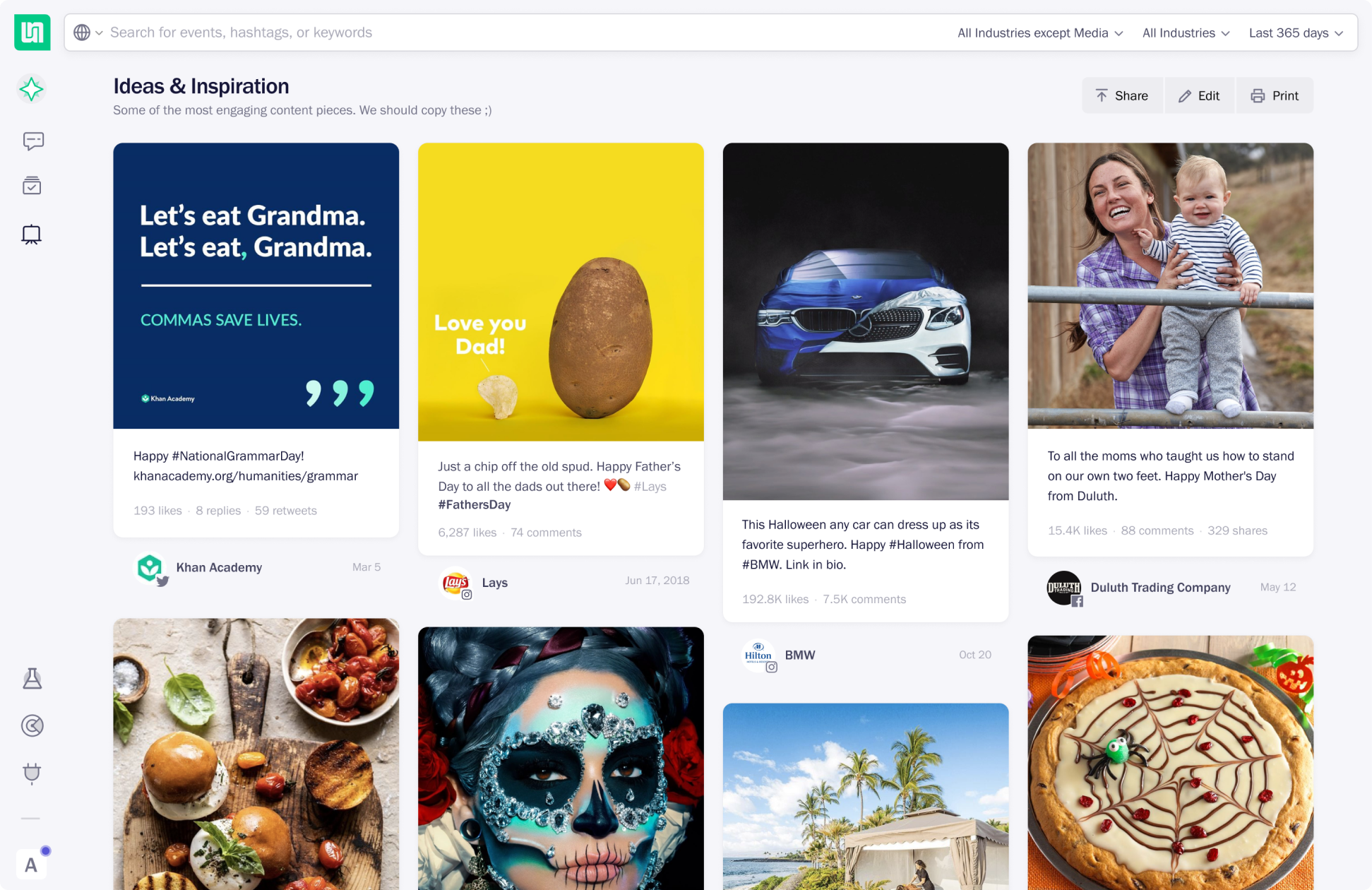
UNDS: Unmetric Design System
Design systems are usually created in larger teams to have a single source of truth that allows for a scalable UI and visual language. At Unmetric, I was the only designer doing hands-on design work on products and website till 2018. I created UNDS mainly to reduce my workload, build new features fast and help developers easily fix UI bugs.
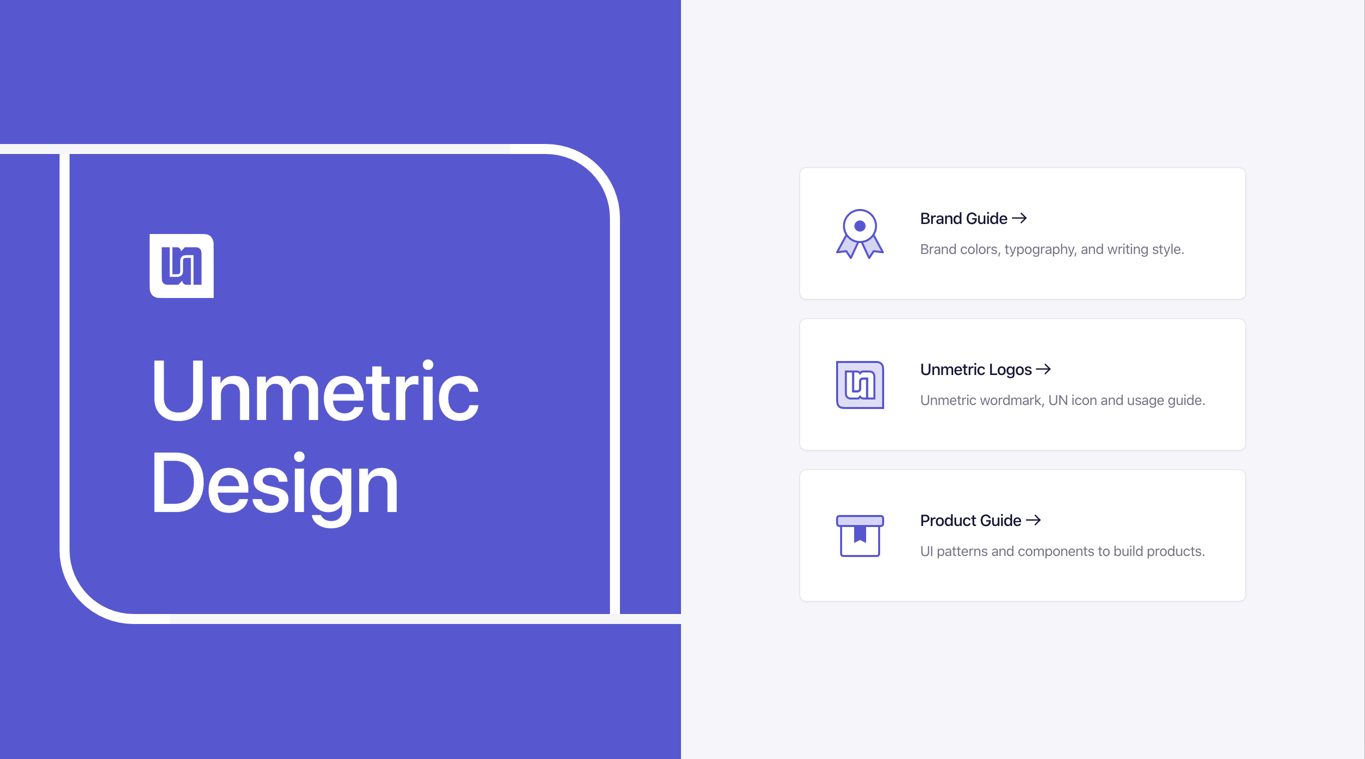
My Role
- Project Lead
- Copywriting
- Documentation
- Information Architecture
- Front-end Development
- Website Design
- UI Design
Team
- Head of Marketing
- Copywriter
- Two Front-end Devs
- Product Designer
- Myself
Tools
- Frontify
- Visual Studio
- Netlify
- Jira
- Google Docs
- Figma
Timelines
- Seven years
- 2013–2020
- Over 50 releases
Why and How
Why build a design system for only one designer?
I didn’t fancy having a design system because the big guys and a few others were having one. For me it was about:
- Reducing my workload: For every small addition, I had to write the front-end code to convey how the UI will work on the look. With UI components, I could simply sketch the UI and point the developers to the right component.
- Speeding up the UI development: Even if I had to do it, I could quickly copy-paste the UI code from a dedicated place and share it with the developers.
- Reducing UI issues: Once I hand off the UI, there were still a handful of UI bugs reported during the testing. I wanted a place where the QA team members can go and find a fix.
- Providing brand assets to the marketing team: Every once in a while, someone would ask me where are our logos and if there are any usage guidelines.
5 years in the making
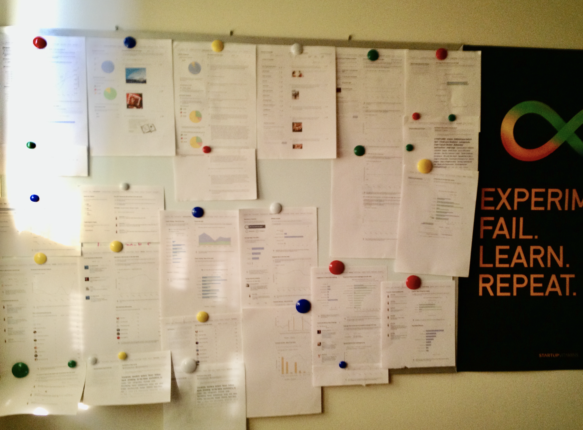
My first attempt at building a UI components library was in 2013, when the atomic design just came out. Back then, I just joined Unmetric full-time and started with making the platform consistent. I conducted a visual audit by printing all the existing screens, put them on the wall, and marked the most common elements. This was our first significant product redesign in 3 years.
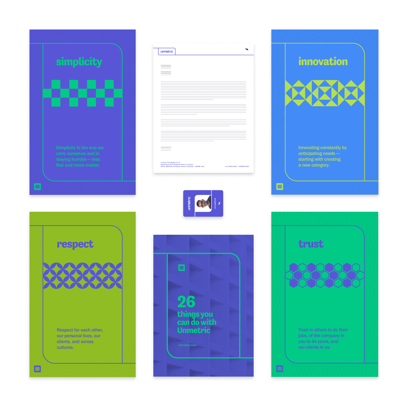
Instead of building a complete design system that would take months and a lot of resources (which we didn’t have), I hosted our brand guidelines and UI library at Frontify. This allowed our marketing team to have direct access to brand assets. I also worked with our copywriter to add Voice and Tone guide.
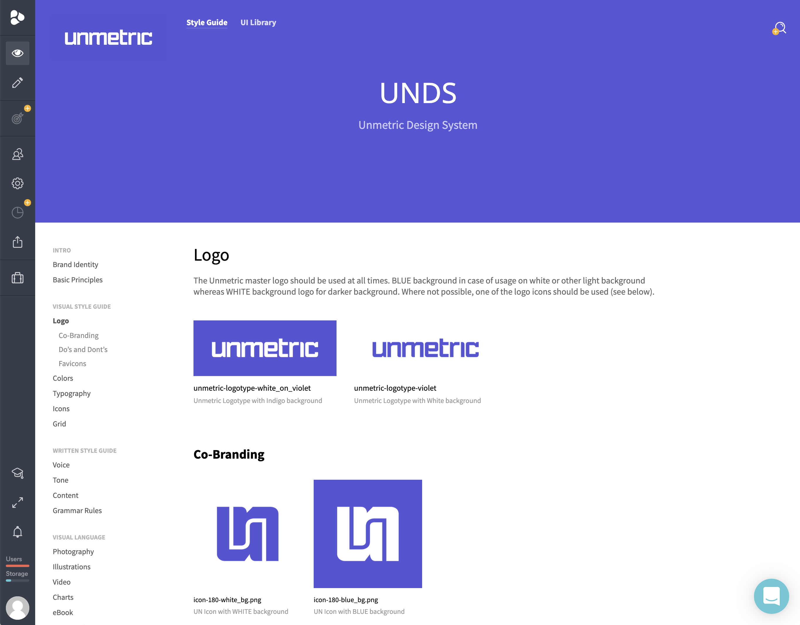
After we hired two front-end developers and a senior product designer, we were able to add more comprehensive documentation around our product and brand guidelines.
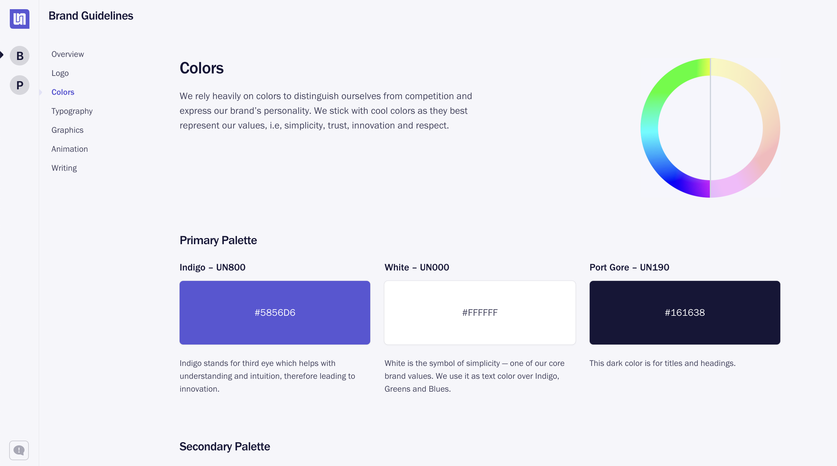
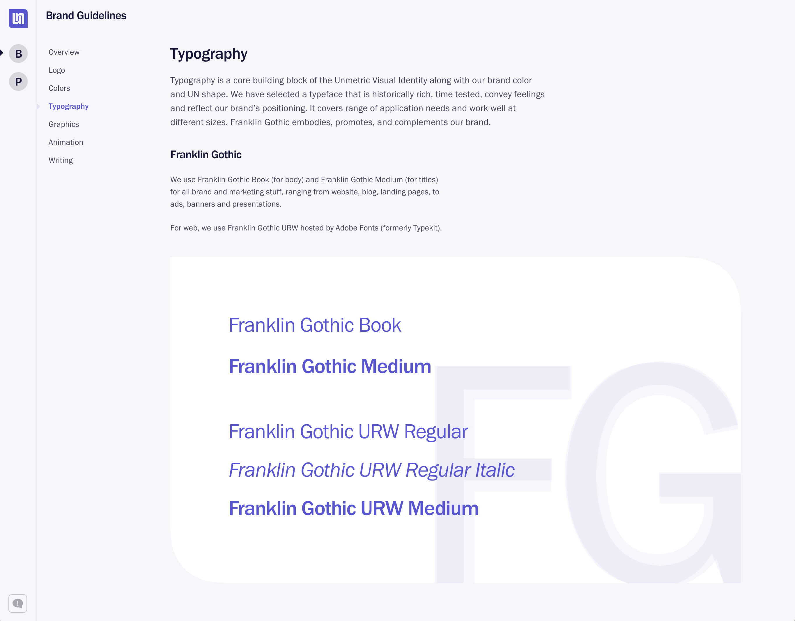
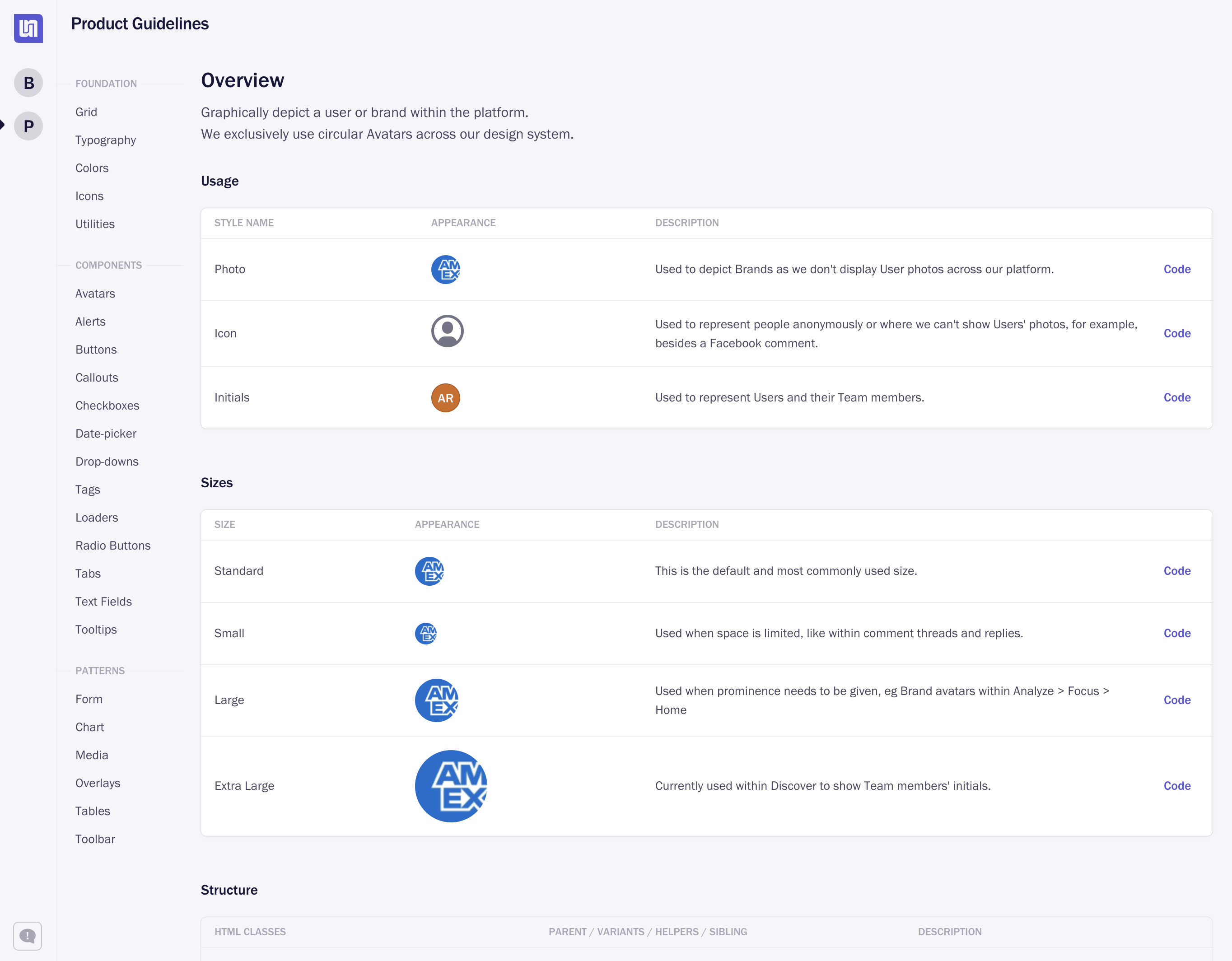
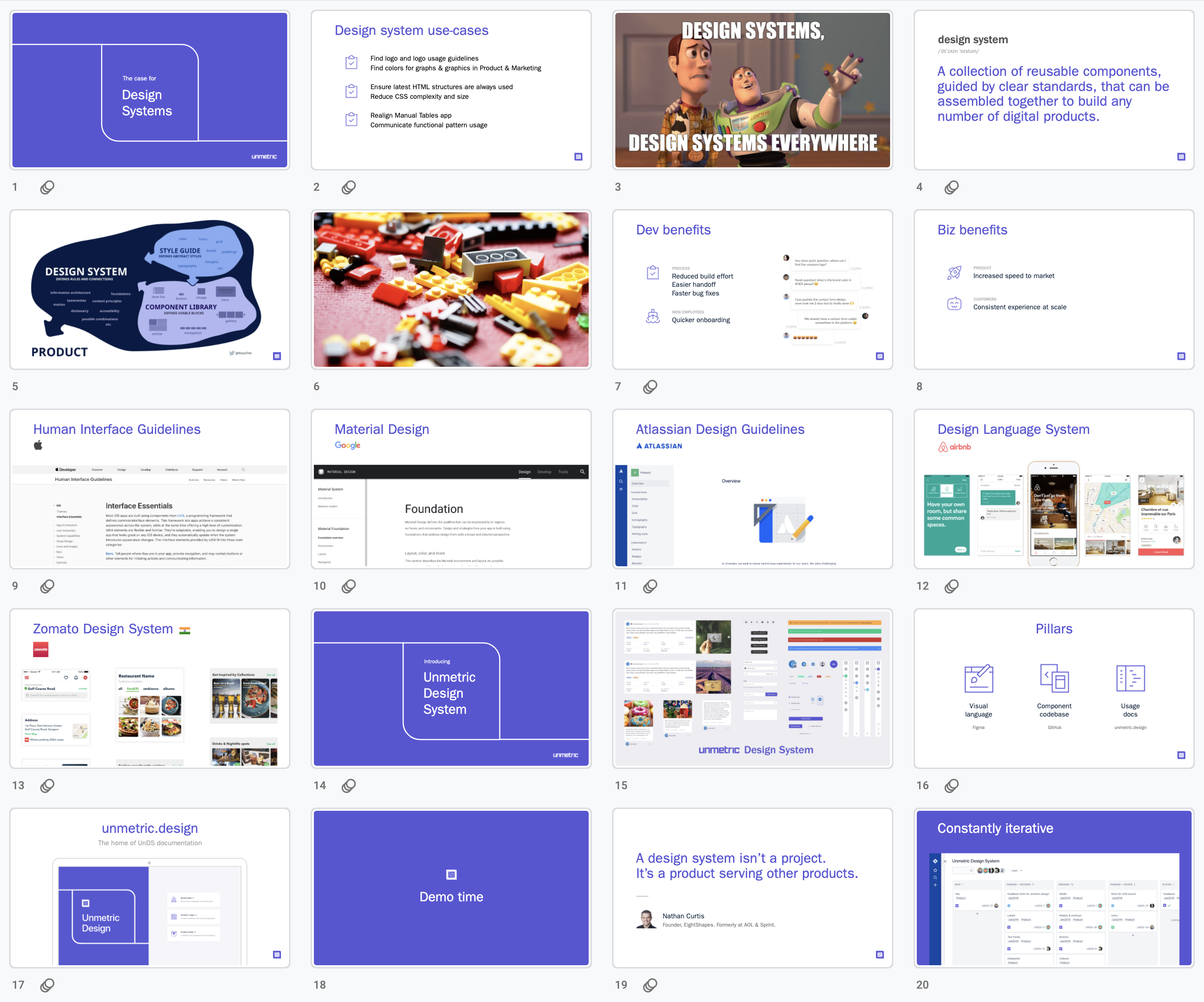
I handed over the design system management to our senior product designer, in 2018, to spare myself to focus more on strategic and operational responsibilities. To expand our design system, we also held a meeting with our engineering team, Head of Product, and Head of Engineering. We showed them what we have build and our plan to add GWT patterns to it so we can speed up the development while reducing the amount of UI issues.
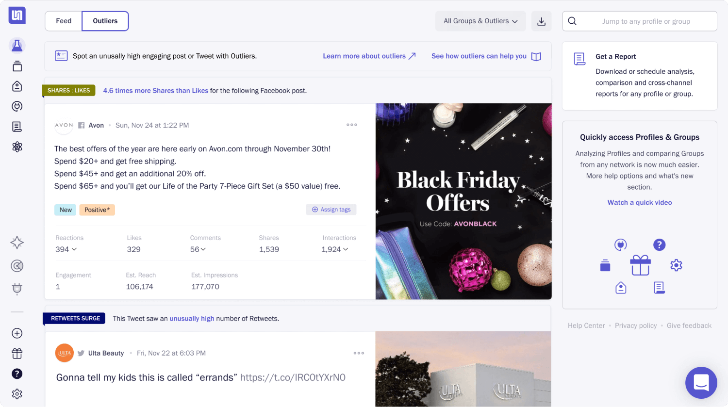
Unmetric got acquired in 2019 while we were still expanding and building UNDS. At that point, we only had UI components library and brand guidelines. In late 2018 we launched Sports app built using UNDS.
