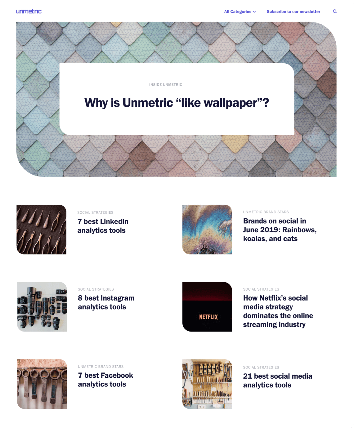
Positioning Unmetric as a leader in social media analytics space and a premium brand.
Having a strong and differentiated brand is more important than ever before. With competition growing every day, both customers and employees need to know what a company stands for. A strong brand helps a company in numerous ways; recognition, navigation, reassurance, confidence, engagement, motivation, satisfaction, which enables better marketing and results in increasing business value.
My Role
- Research
- Project Management
- Art Direction
- Branding
- Visual Design
Team
- CEO
- Head of Marketing
- Graphics Designer
- Product Designer
- Myself
Tools
- Invision
- Google Docs
- Google Slides
- Figma
Timelines
- Four months
- Oct 2018 – Jan 2019
Problem
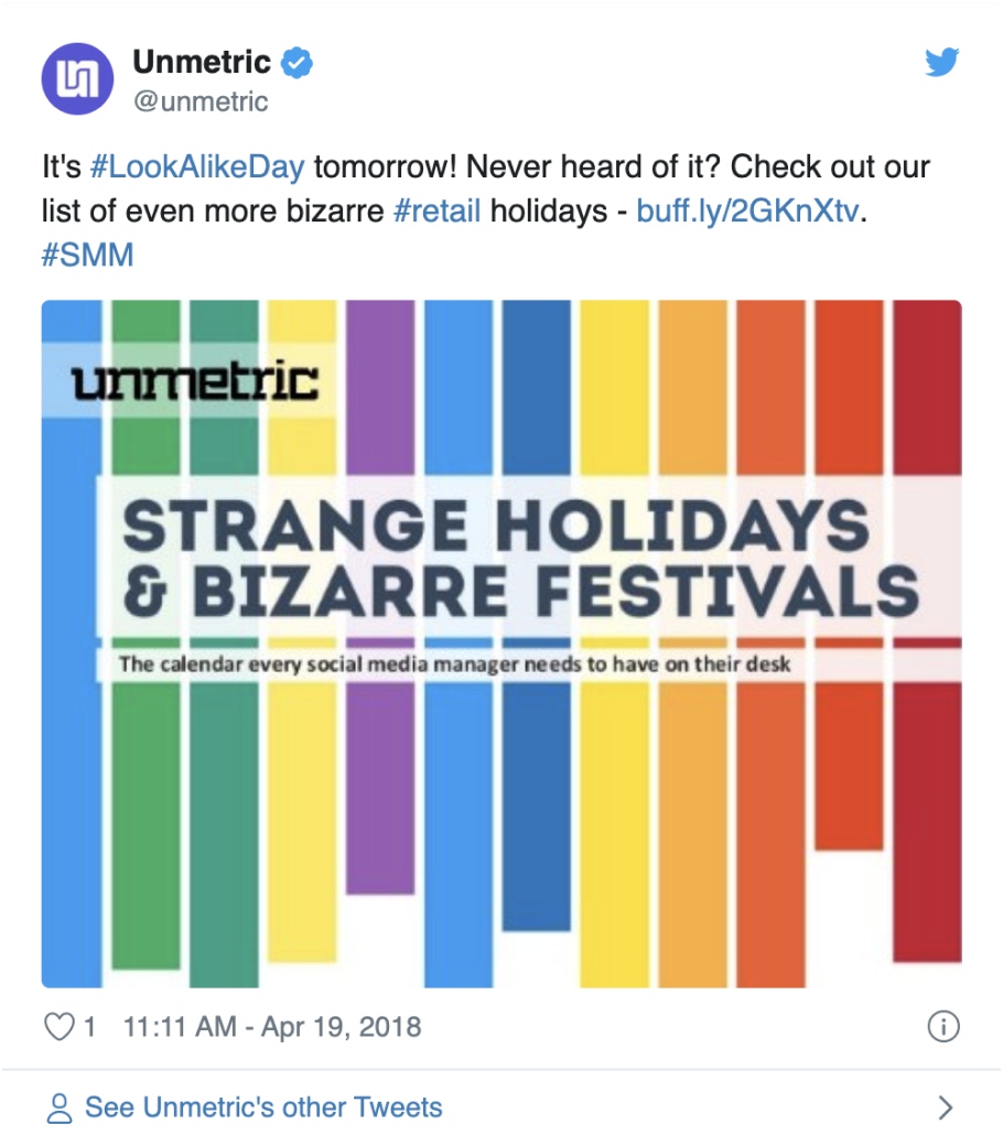
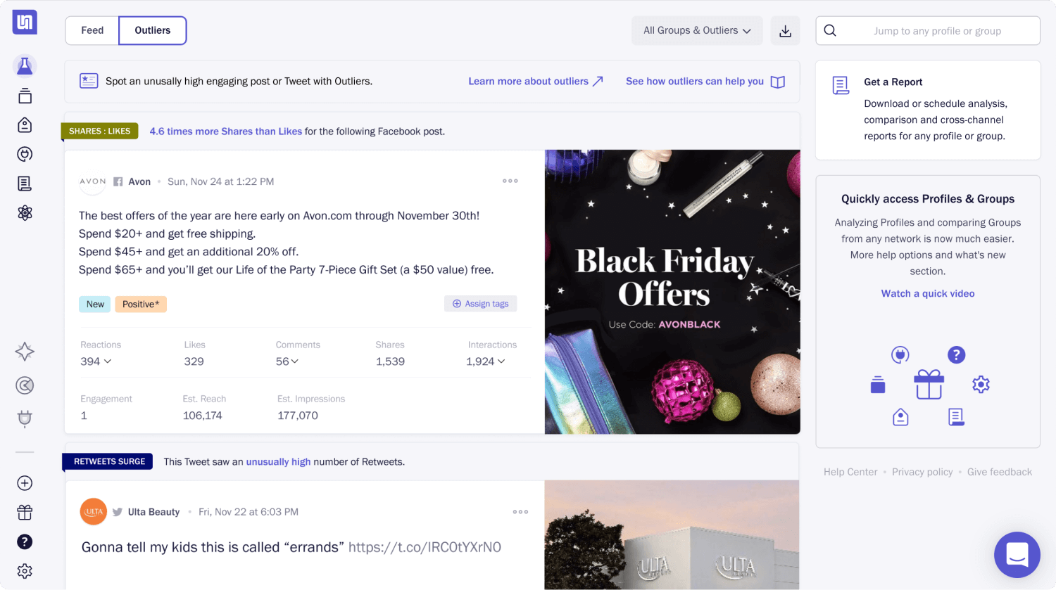
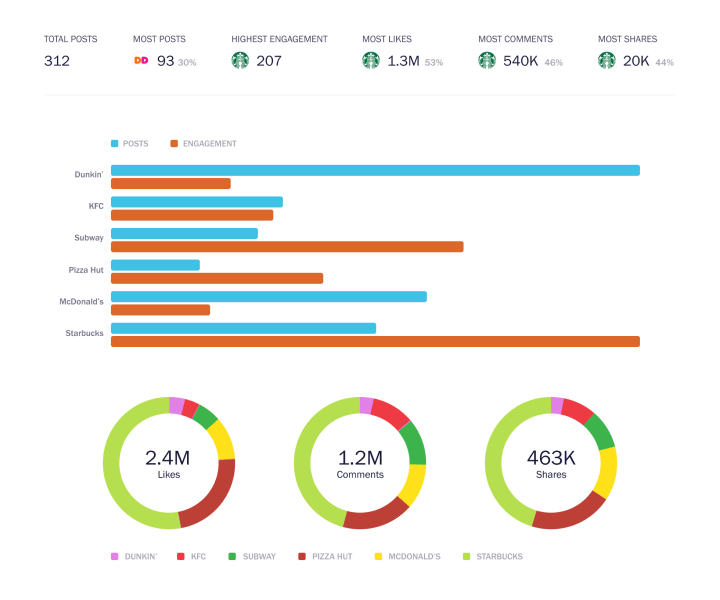
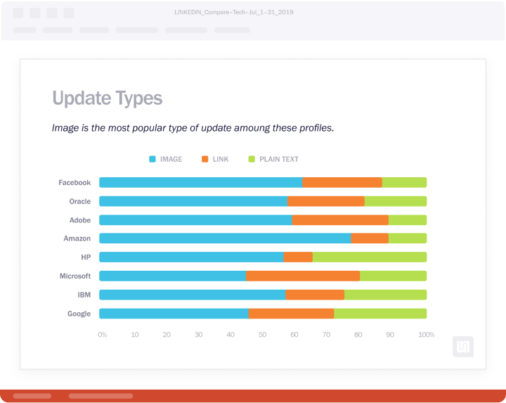
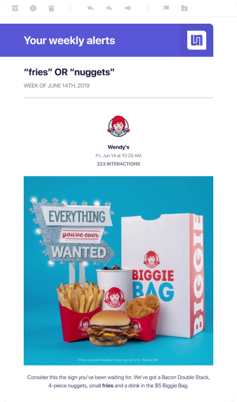
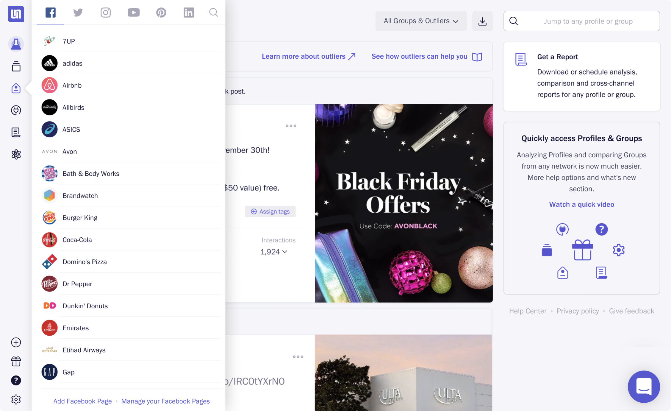
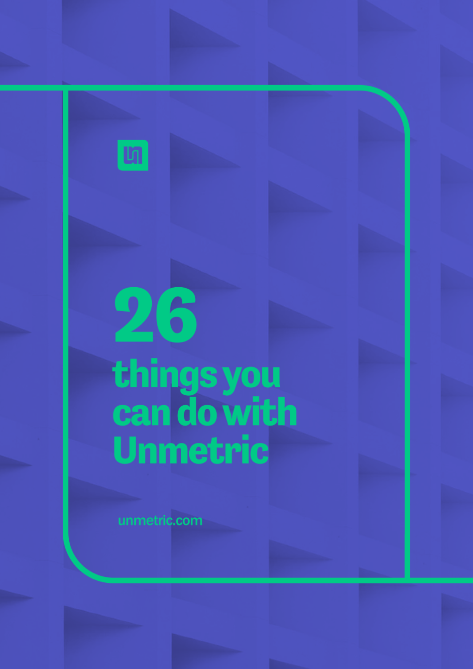
One evening I was going through my Twitter feed and saw this. I reached out to our head of marketing via Slack and asked: “this is not us; it feels like a different brand.” He also was not happy with it and told me that this collateral piece was created long back, and they had no brand guidelines to follow. He was right, amid all the product work, website updates, and managing the design team; this slipped through my hands.
But not anymore!
Process
How did we end up here
Being a fast-paced startup, everybody was wearing multiple hats all the time. My hands were always full with product stuff, along with managing the team. Plus, I was also working on the website and blog. This left almost no time for anything else.
I’ll lead this one
As branding is a crucial and delicate aspect for a company, I decided to lead the project. Within two days, I assembled the team with our CEO and Head of Marketing being the stakeholders, and three designers (including me) to brainstorm and come up with ideas.
Unmetric was founded in 2010, and I have been designing it since then. I was among the team of three people who started working on it. Therefore Unmetric is very special to me, and I understand it better than most people in the company.
It was impossible for me to pause other projects and dedicate focused time to this project. So initially, I spent a few hours on the weekends. Later, I worked one day per week to push things faster.
Let’s do some research
As usual, I began with research and started digging on how to go about such a big project. Our senior product designer and I have some experience design logos and stationery for startups, but this was on a bigger scale.
Fortunately, I had the ultimate book on the subject “Designing Brand Identity” lying on my bookshelf, which I started reading right away. I took notes and shared with the team, so we are on the same page about the approach and process.
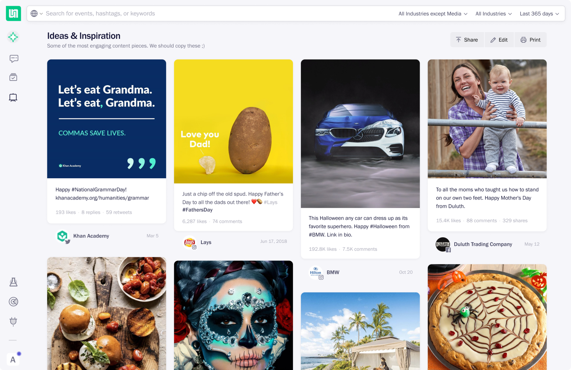
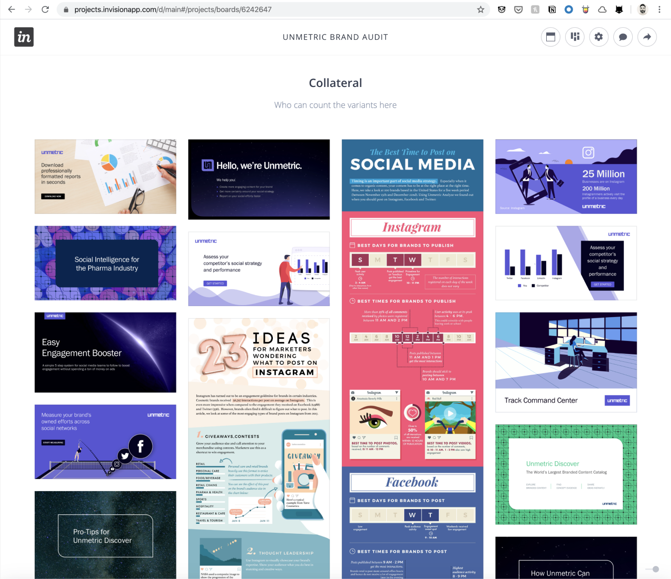
As recommended in the book, the first thing I did was the brand audit. I created an Invision board where we compiled commonly used images on our blog and social channels, illustrations and infographics, collateral covers, banner ads, and social posts.
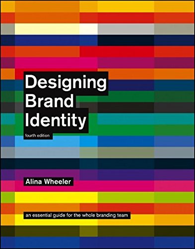
Must read book for anyone working on brand identity. See other books in my library
A peak at the competition
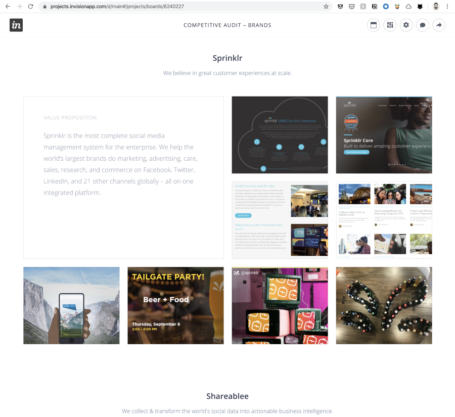
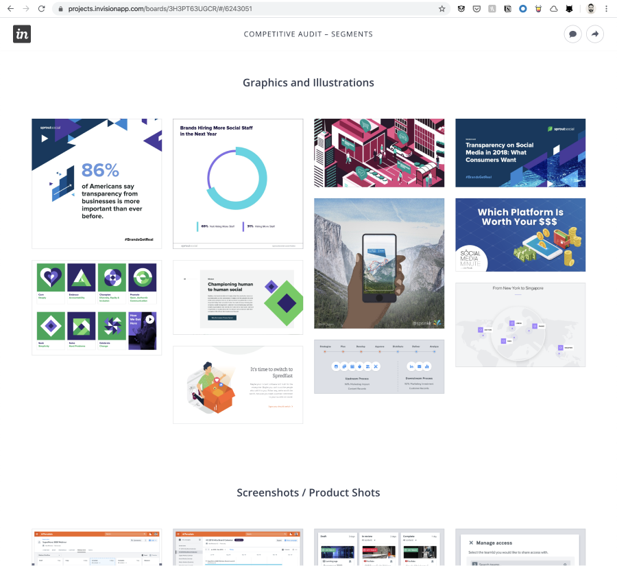
Next, we started to look closely at our competitors, their messaging, website, social handles, and overall visual identity (logos, typography, icons, color palettes, ). This would help prevent our brand from accidentally ending up like theirs. That’s the whole purpose of branding, right – coming out as a different brand with unique values and staying true to them.
Narrowing the focus
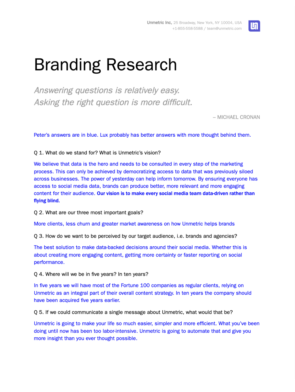
After diverging (looking at the competition), it was time for converging. I created a branding research doc with essential questions to understand and outline our brand vision, company values and beliefs, goals, and target audience. Our head of marketing completed it within a week. This exercise helped us create a shared language in terms of what Unmetric stands for.
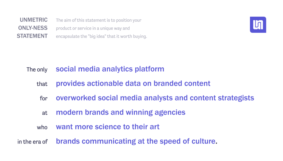
It also included a highly recommended research activity for branding – the only-ness exercise. I did this same exercise at a workshop run by Dan Mall at Smashing Conference in Toronto. It was fun on both occasions.
Here comes the brief
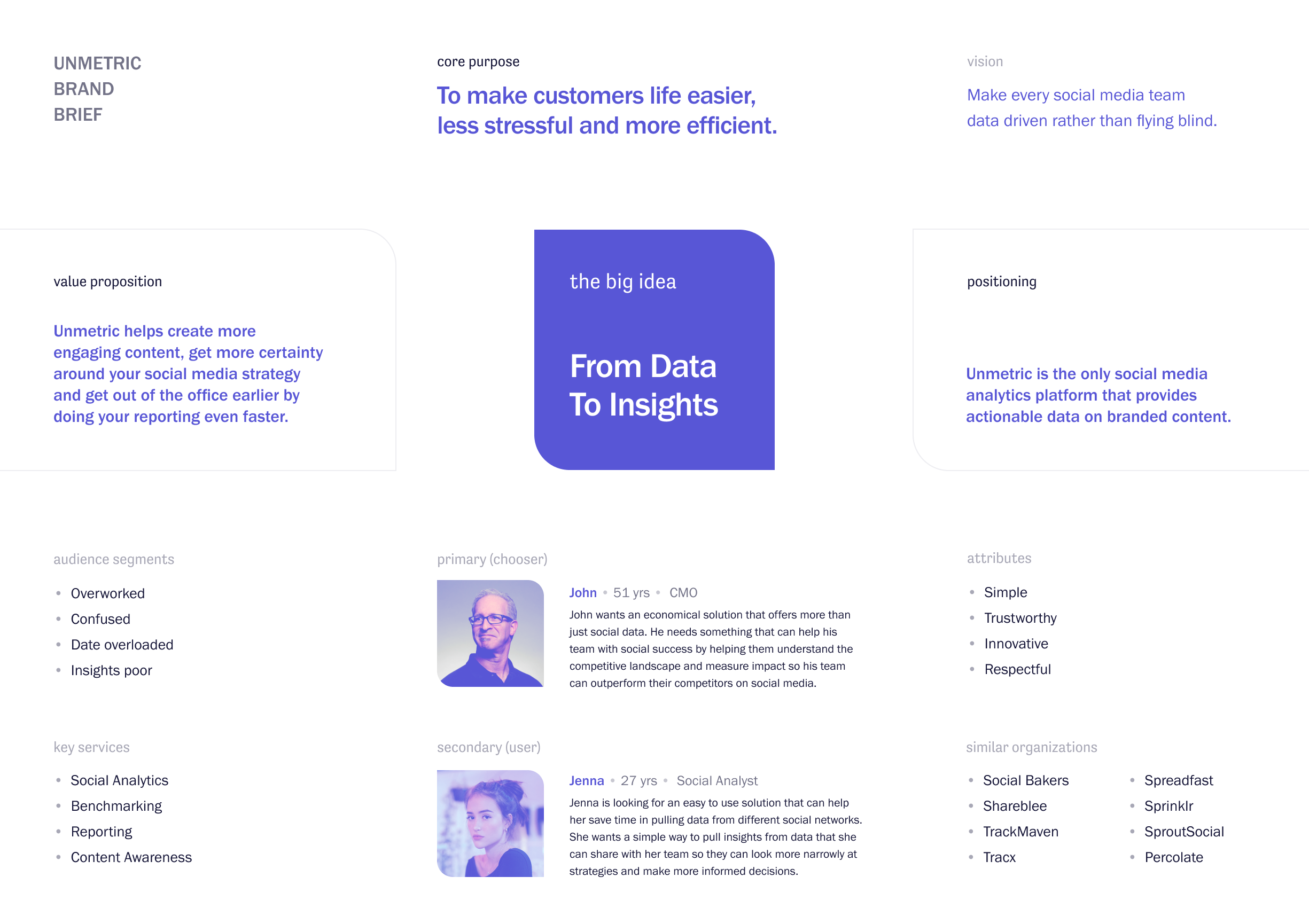
After gettings answers from our Head of Marketing and CEO on the brand research doc, the next important step was creating a brand brief. Once we created our brand brief, I sent it for sign off.
The brand brief is a foundational document that clearly articulates who we are and why we exist.
Now, let’s explore all four corners/directions
We explored more than four visual directions but decided to go deep on the following four. Here’s our rationale for each direction and why it might work or won’t work:
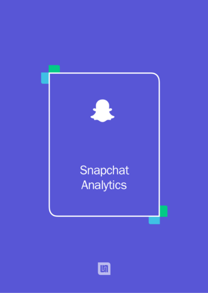
We tried to attach a bicolor flap with an outline to create a unique identity. These two colors are from our existing color palette and belong to two of our products. This idea was dropped because as we thought being a little colorful it might dilute the strength of our brand. See Competitive audit by Segments Invision board
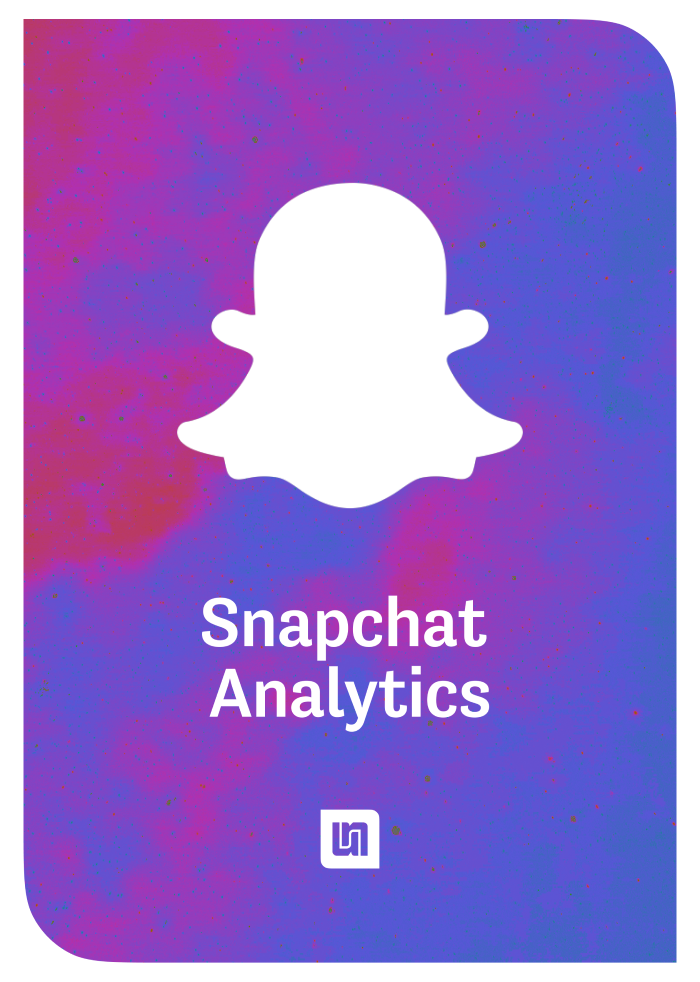
In this direction, we filled our logo shape with a colorful abstract background image. However, we felt it was trying too hard at being unique and looked more like a cultural/activity brand. See Competitive audit – segments board on Invision
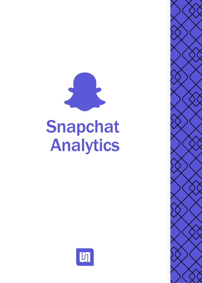
Our graphic designer came up with this direction built on some background patterns we were occasionally using in the past. It was simple and easy to implement but it resembled to a very well known brand out there – Uber. See Competitive audit – segments board on Invision
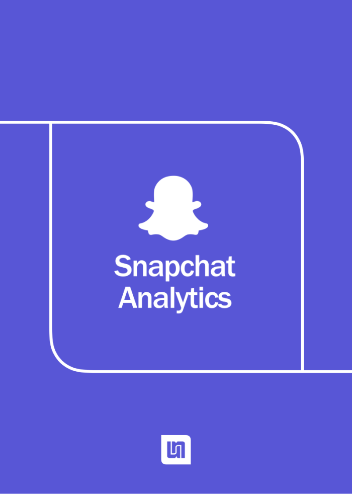
This one is focused on the outline of our logo while connecting from one end to another. It was simple and unique, and we felt we could tell a story with it, i.e., from data to insights, from humans to machines, from Chennai to New York. See Competitive audit – segments board on Invision
Time to show it to the boss
After months of research and exploration (on the weekends and whenever we had spare time), it was time to show the results to our CEO. I talked to him, and we set up a 1-hour meeting in two weeks.
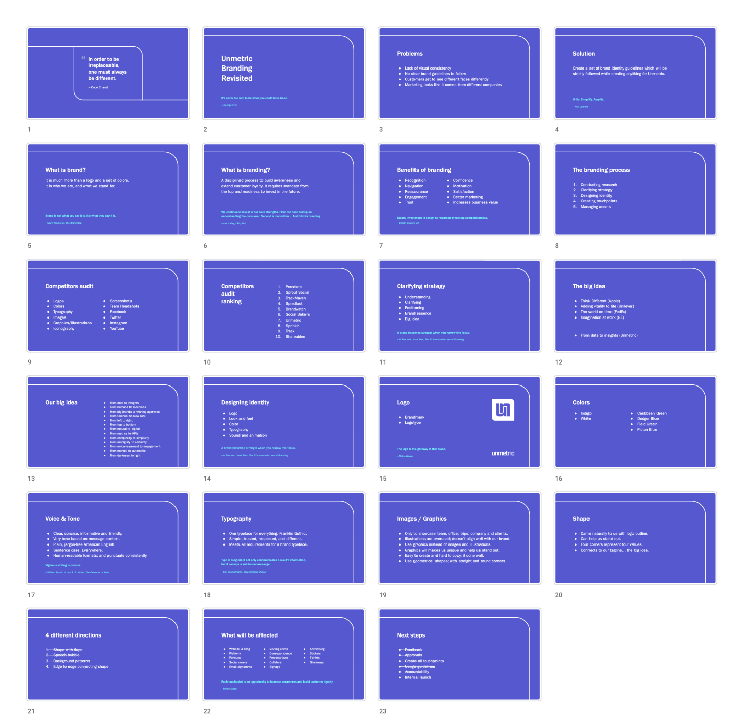
I compiled everything – three Invision boards, my notes from the Designing Brand Identity book, plus the four directions we tried – in a Google presentation and created a story around it.
In the meeting, I took our CEO through the basics of branding, benefits, process, competitors audit, and ranking them based on the visual identities, outlining our strategy and execution plan. Our CEO liked the work we did and effort we all put it besides being busy with other regular work. He asked us to choose one of these directions and let him know.
Results
We’ve a winner!
Out of the four directions we explored, we decided on the “SOUTH”. We all agreed that it was simple yet powerful, unique without trying too hard, easy to create unlike the first three directions.
We informed our CEO as promised; he agreed, and so did our head of marketing.

Next steps
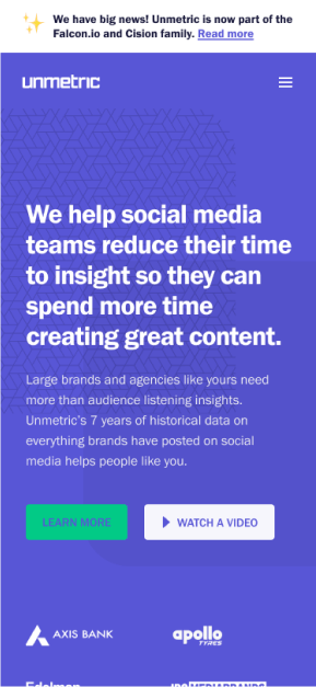
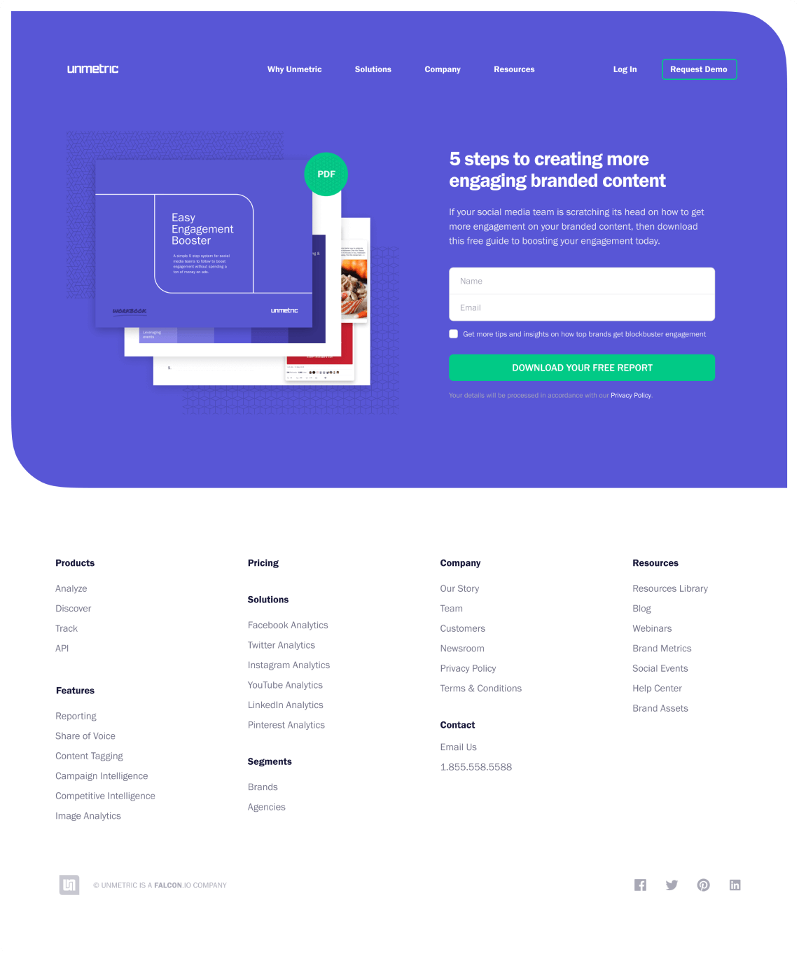
After finalizing the direction, I had a chat with our graphics designer and assigned him collateral that we can update immediately. Within weeks we updated our website, blog, presentations, and templates. We planned the internal launch for the Q3, 2019, but with the acquisition news, we had to pause the internal launch.
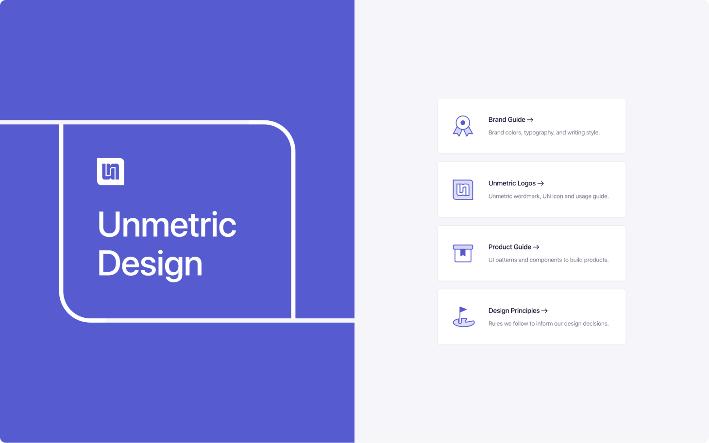
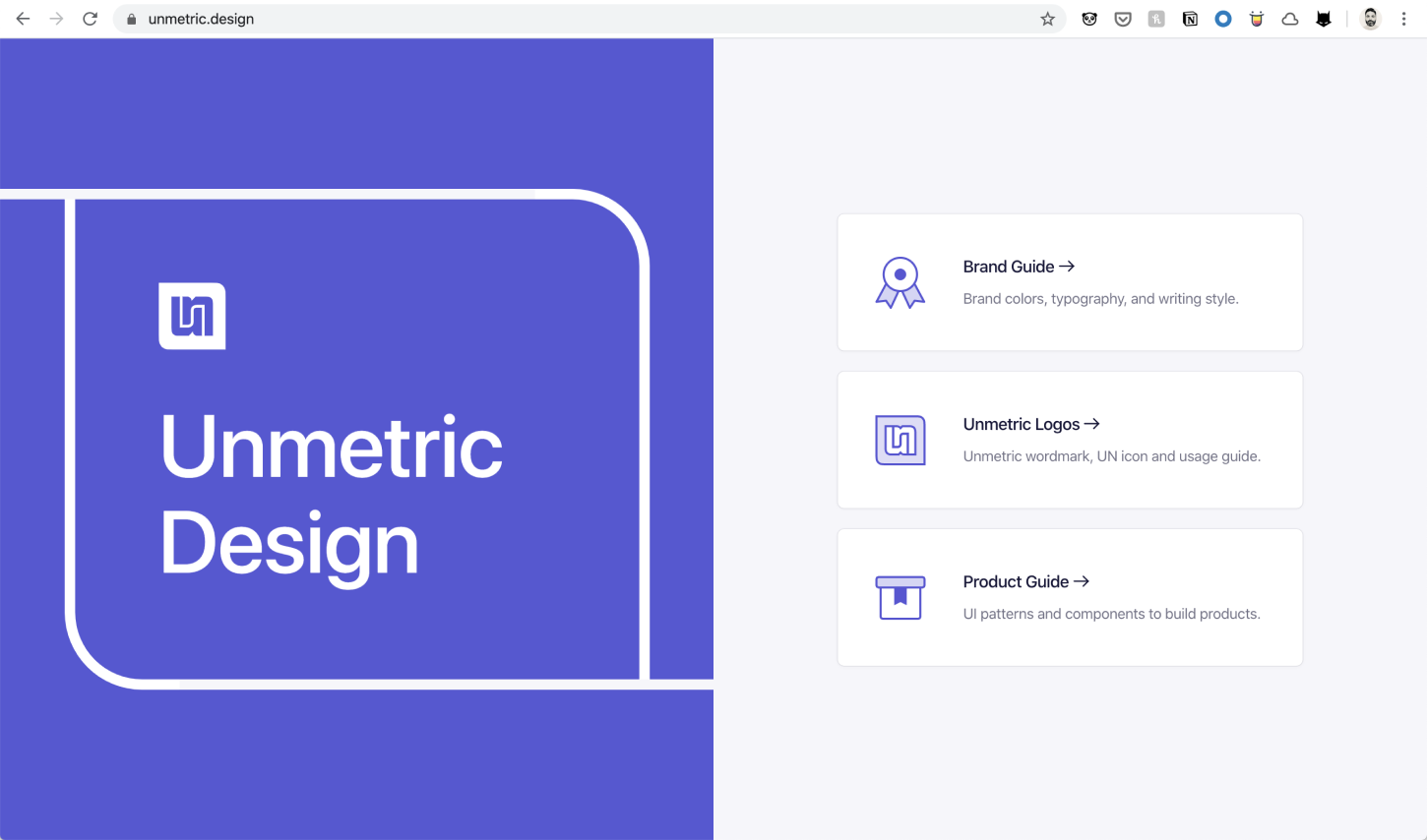
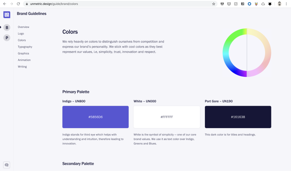
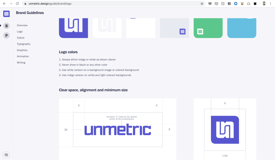
We launched Unmetric.design
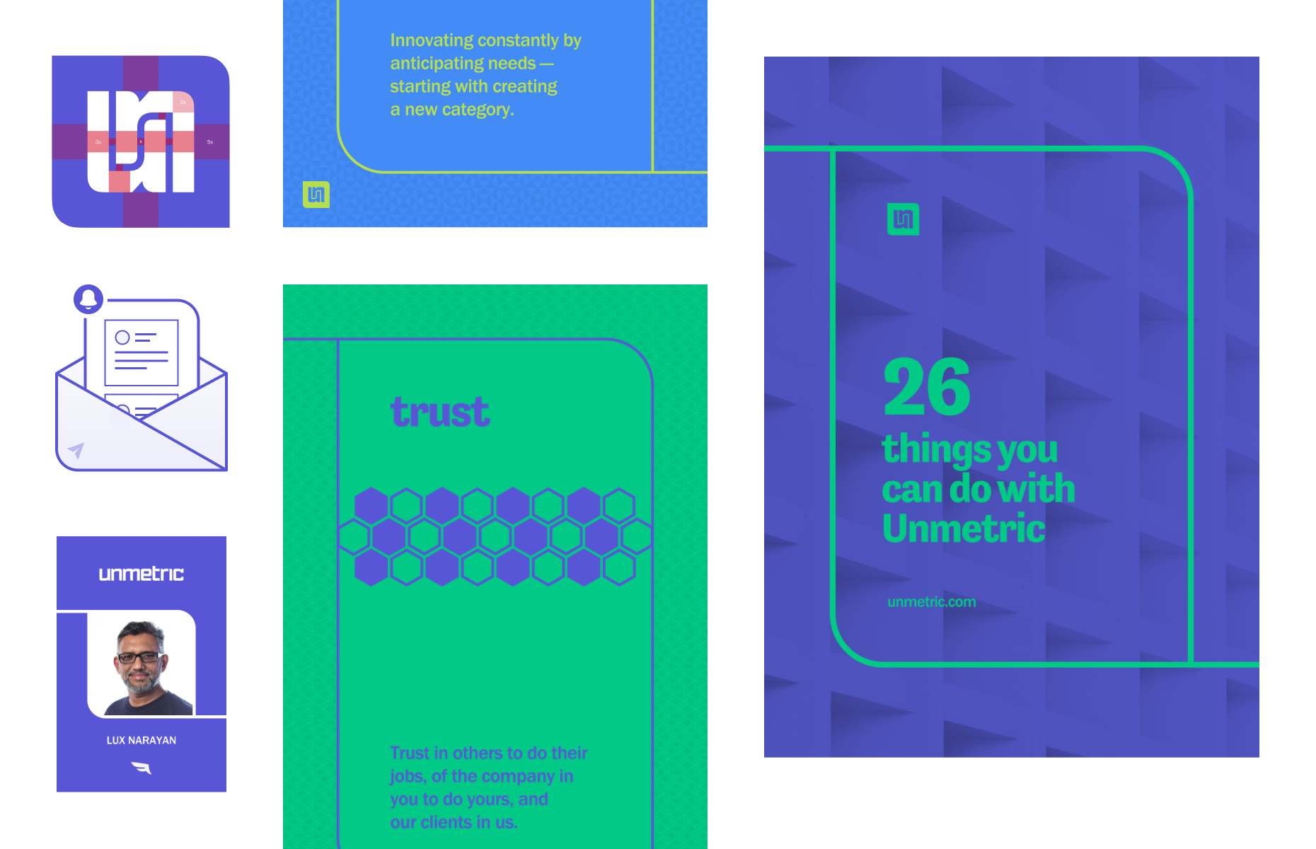
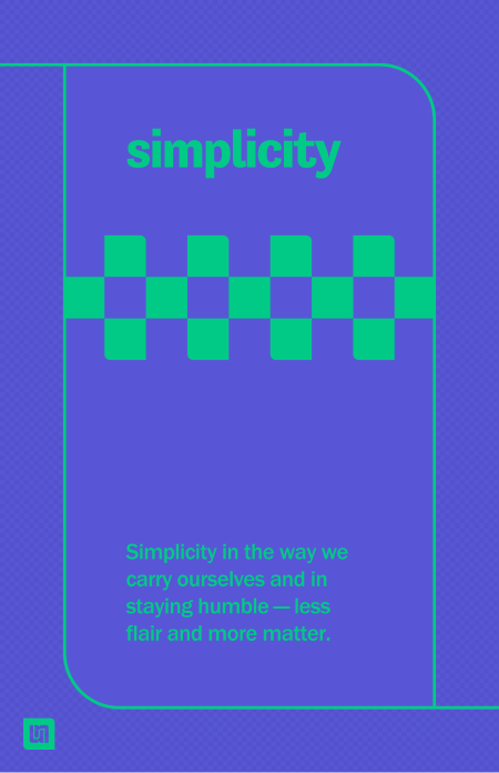
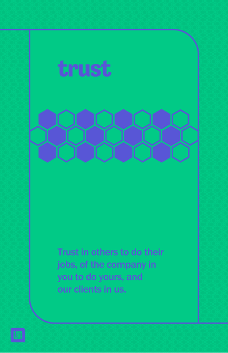
We made these… and more…
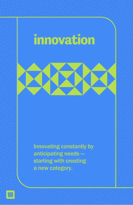
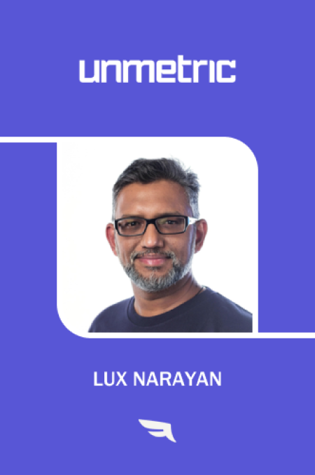
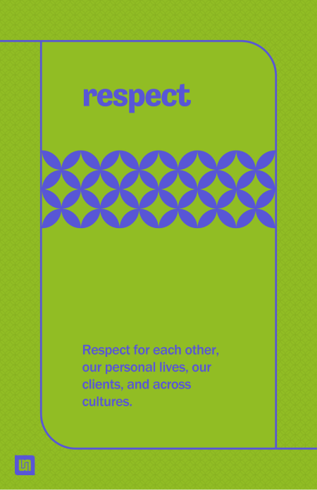
Four posters each for our brand value, one of the collateral covers, a Google ad, and a video cover.


Learnings
- Rehearse the presentation and time it
- Bring more touchpoint implementations upfront
