Saving months of extra work with open collaboration and transparent communication.
From day one, I’ve done hands-on design work on Unmetric’s flagship product – Analyze. This case study is about how I successfully led a significant navigation redesign for the two most used sections in Analyze, simultaneously launched a prominent new feature – Outliers, and redesigned the homepage after five years.
My Role
- Research
- UI/UX Design
- Onboarding Strategy
- Onboarding Video
- Information Architecture
- Usability Testing
Team
- CEO
- Head of Product
- Two PMs
- Two Dev Leads
- Three Engineers
- Two Front-end Devs
- UX Copywriter
- Myself
Tools
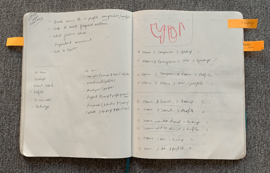
- Moleskine
- Sequeal Pro
- Figma
- Camtasia
Timeline
- Eight months
- Apr–Nov 2019
- Four releases
Constraints
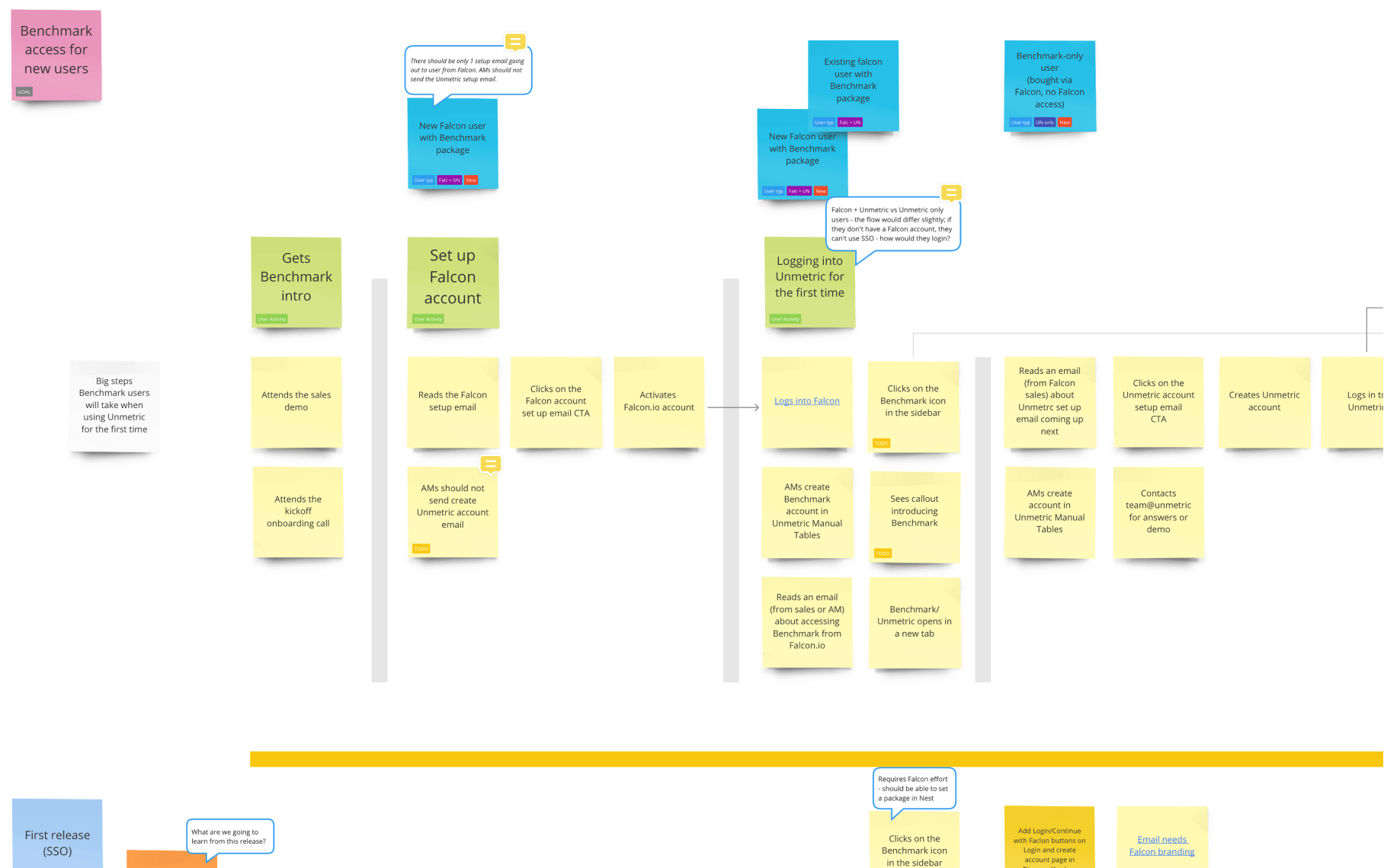
- Two separate teams working simultaneously on two major sections of Analyze that overlap. Without proper planning and collaboration, we would have to redo months of work.
- The team was in four separate places and three different time zones, so we had to be extra careful to stop things from falling through the gaps. Communication was the key, as always.
Problem
Navigation was hard
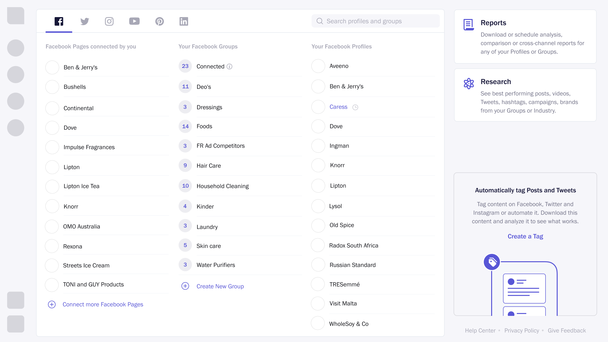
In Unmetric’s flagship product – Analyze (the social media benchmarking tool) – the two main tasks performed by 100% of the users are:
- Analyzing your owned profiles, competitors, or any of the 100K profiles
- Comparing Groups (a set of social profiles)
In the older solution, we made it easy to discover and use these two features. However, the recent feedback revealed that the users find it hard to navigate and search for a brand if they have added a large number of profiles.
Validating the problem
I talked to our customer support team, asking if they have heard any other feedback related to these primary tasks and sections of Analyze. They told some users are using Command + F to search a profile they are looking for.
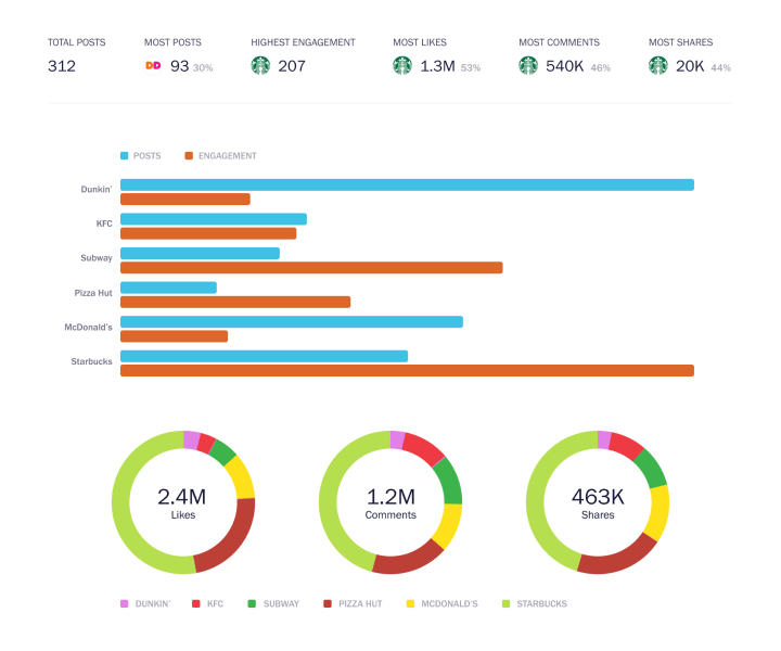
In the last few years, we signed up big brands, like, Unilever, Coca-Cola, GM, Pepsi, Accenture, Edelman, etc. and they needed to analyze a large number of profiles.
Clearly outlining the problem
After validating the problems with our customer support team and some brainstorming, I broke down the problems as:
- Profiles were sorted by added date and not alphabetically
- Groups were sorted by creation date and not alphabetically
- Connected pages are hidden
- Not easy to switch/discover other social networks
- Homepage remained the same when networks were switched
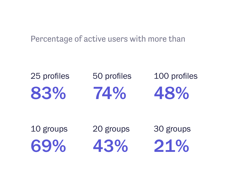
This made it hard for users to find profiles they need to analyze, especially when they have 50 or more (74% of total active users).
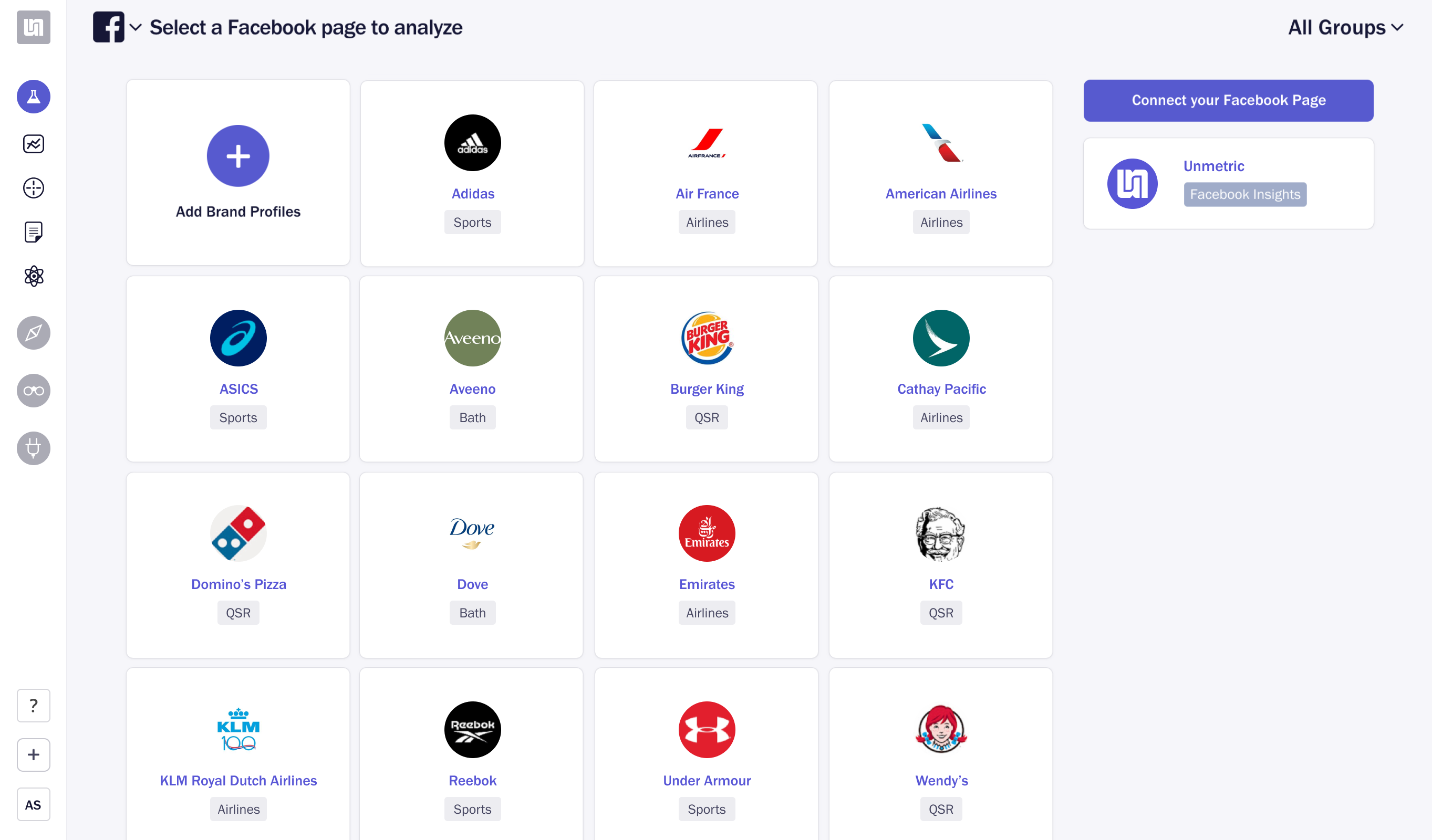
This is the old homepage design. See how the networks are hidden under the drop-down (problem #4).
Also, notice how the content remains the same even when networks are switched (problem #5). Some of these links would just take users to the dedicated sections under a selected network.
Process
No data, no problem
There was no Mixpanel dashboard configured to see this particular data set, so we pulled data from the database. I collaborated with another developer to setup Sequel Pro and a few SQL queries to pull that data.
Alphabetical sorting to fix problems #1 and #2
Data analysis reflected that most of our users (70-80%) might be facing issues to look for profiles and groups. There could be a bunch of approaches, but I decided to go with a solution that required least effort: alphabetically sorted profiles and groups (by default) and the added ability to search for profiles.
Solution for problem #3
Another frequent feature request was to move Connected/Owned Profiles to a dedicated, more visible section. This came from our accounts team as they believed that this is a very important feature to make users stick and get the most out of our platform. And having it buried under the Analyze section is not helping.
My plan was to move it to the main navigation in the sidebar so people can see it from anywhere. This will make it more discoverable and accessible.
A designer’s endless pursuit for improvement
Even though the main issues were fixed, I was not happy with our homepage. The most visited section of the app was unthoughtful and plain dumb. Nobody ever complained about it, though. No complaints don’t mean it’s perfect.
The first solution
I started brainstorming to see how I can fix the homepage. Moving the most important actions which were somewhat deeper in the app came to my mind right away. After some sketching and scribbling, I came up with a rough solution that included:
- Change networks drop-down to tabs and put on the homepage
- Move profiles, groups and connected accounts under network tabs
- Add ability to search profiles and groups across networks
- Ability to star profiles and groups, so they are pinned on top
- Sort by recently accessed, date added/created (default), and alphabetically
Feedback always helps
Our CEO asked me why we are making these changes and how this will help. After he was convinced with my answers, he suggested to get rid of “sort” and “star” functionalities as multiple users from the same organizations use the same login. I didn’t know this fact, but after he told me his suggestion made absolute sense.
Something important was cooking simultaneously
When the homepage design was almost complete, and I was ready to hand it over to our front-end developer, I got a message from our data science lead. He provided some info on an upcoming feature: Outliers.
Data scientist suggested that we add a dedicated section for Outliers in the main navigation somewhere as it a unique feature among competitors. This placement would give this feature more importance and visibility in our platform.
I liked his idea but suggested that instead of adding another section (we already had over ten icons in the main sidebar), why not put it on the homepage? That will make it even more discoverable and prominent.


All dashboard should be feeds
Our CEO and I always agreed on all dashboards should be feeds argument. This was our chance to make Analyze dashboard/homepage a feed of content insights, i.e., Outliers. And later on, we can add more types of insights that we were showing inside the main sections. Currently, users had to go to these sections and tabs and see those insights for themselves. Pulling them out on the homepage and letting users customize what’s useful for them would definitely be a game-changer.
I suggested to put content feed with Outliers as a second tab (as both are content streams) on the homepage while moving profiles and groups in the sidebar as a mega menu. All of us agreed on this solution.
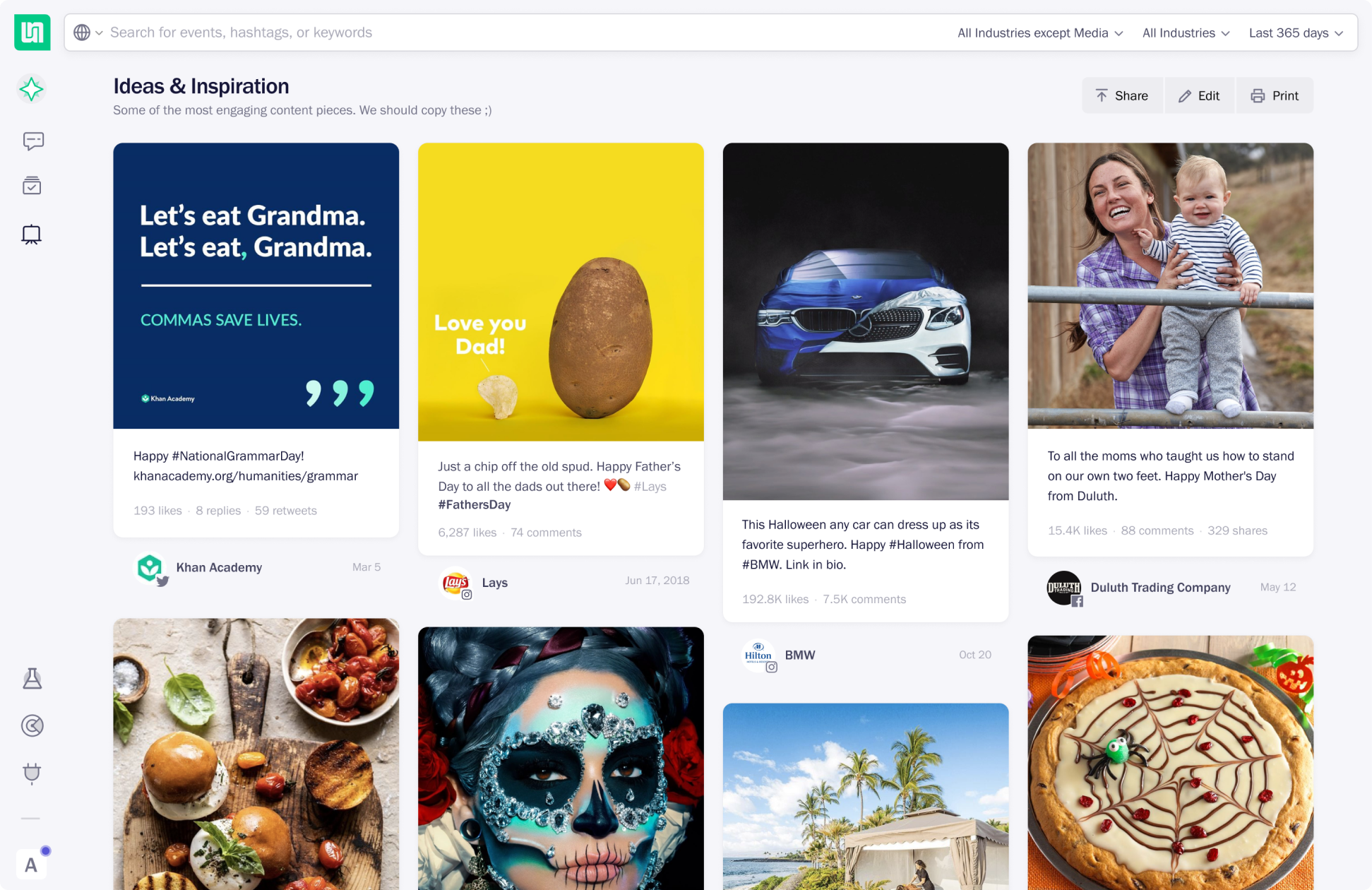
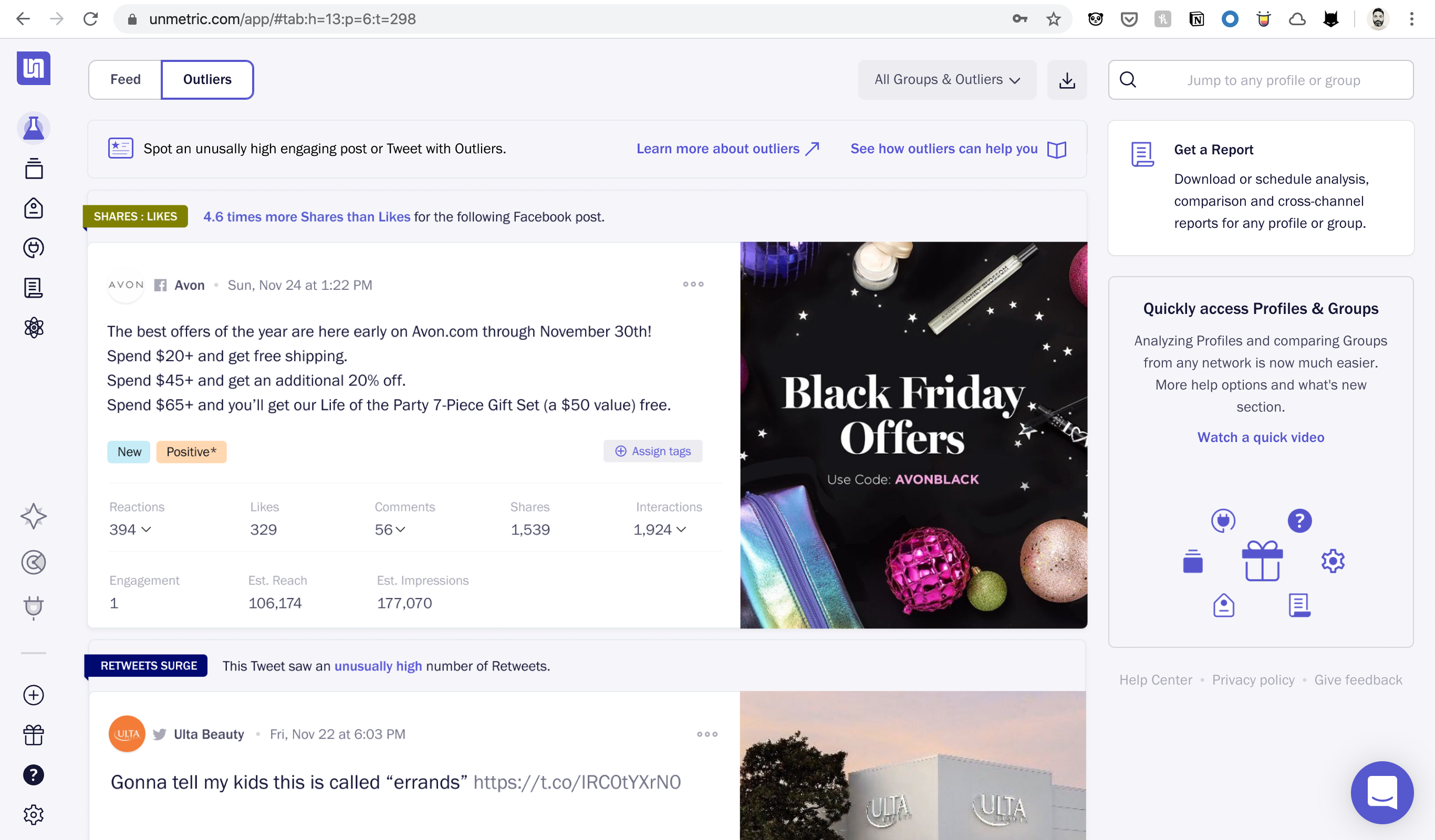
The final version with Feed and Outliers.
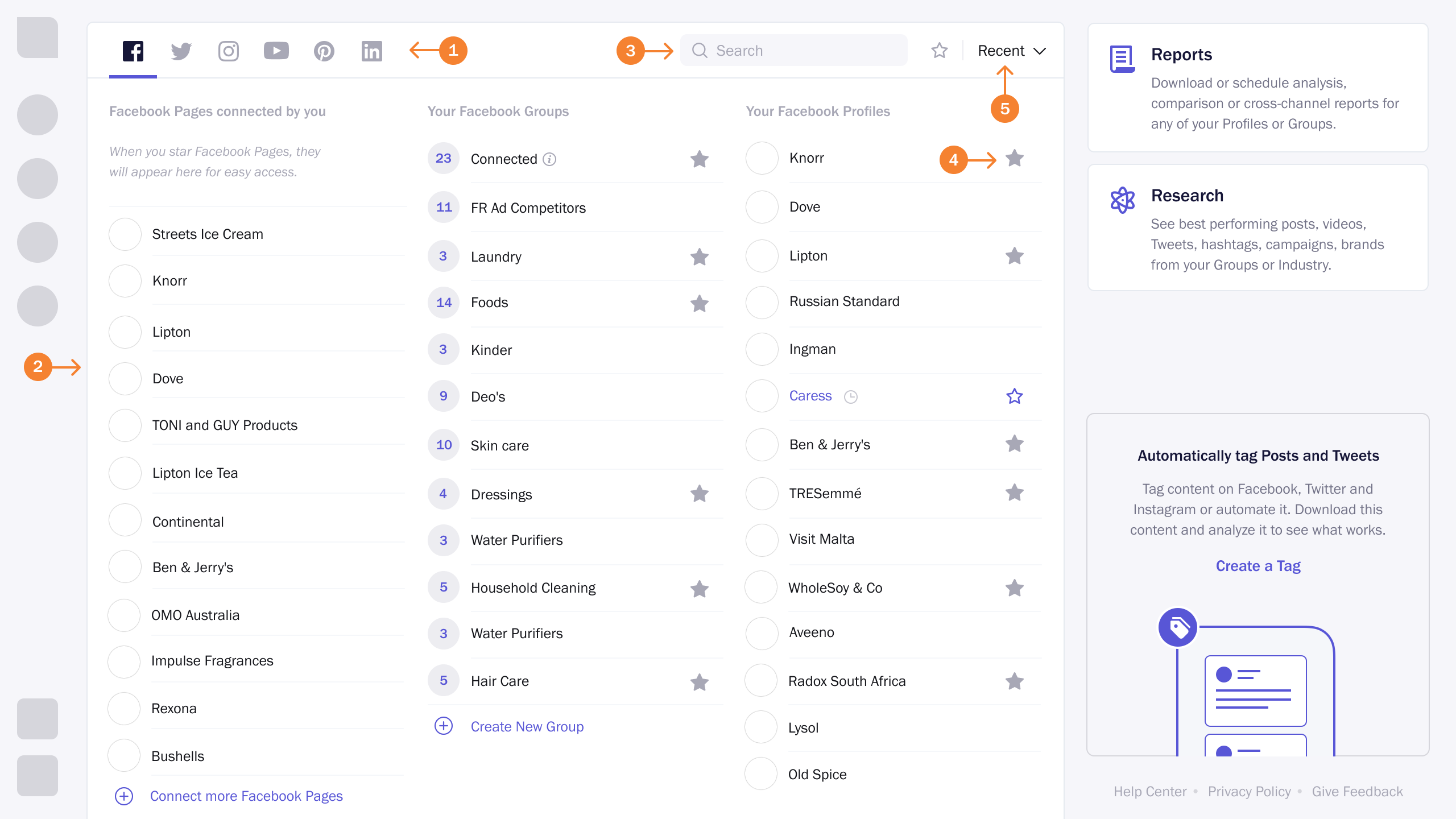
Super easy way to access profiles and groups
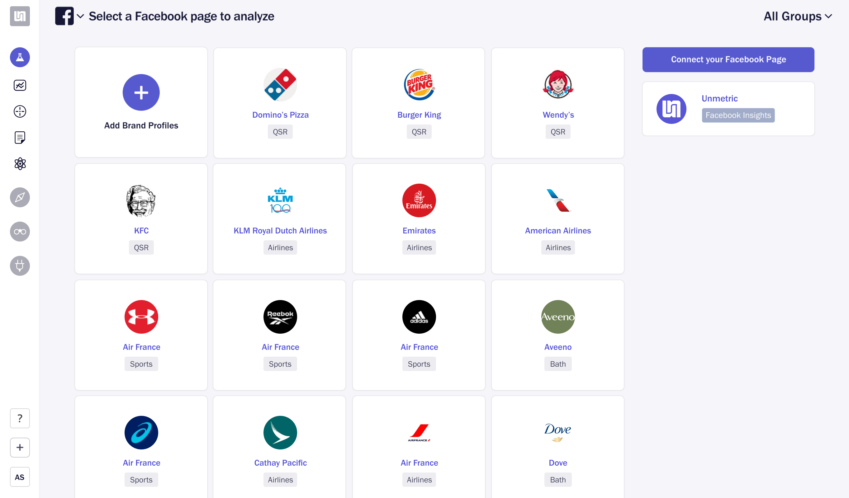
After putting Outliers and Feed on the homepage, I went on to find the best possible place to access Profiles and Groups. With one click, users can access any of their Profiles or Groups. All the networks are now clearly visible. One can quickly search for a profile without jumping between networks. I also added links to quickly add/create and manage Profiles and Groups.
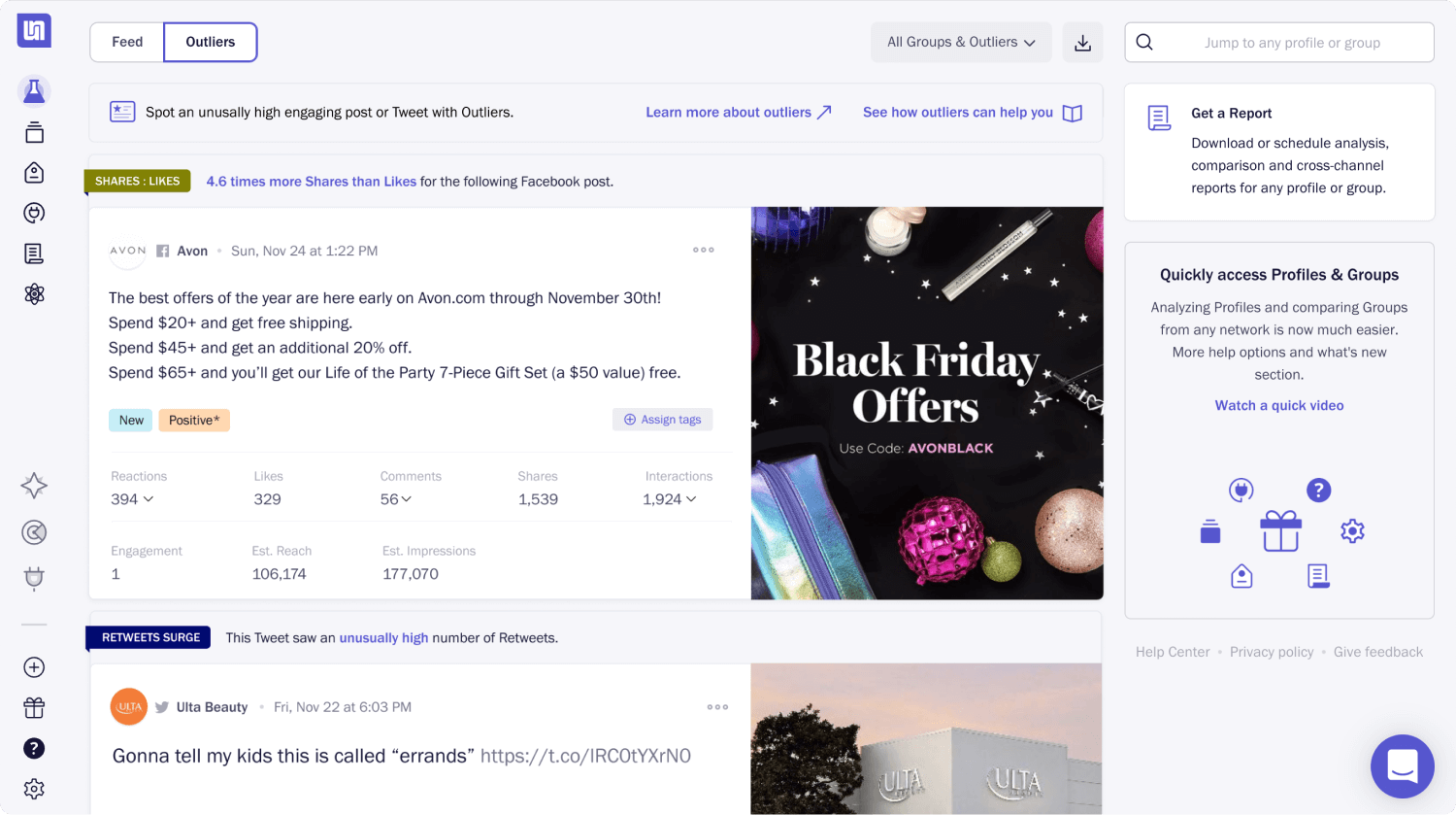
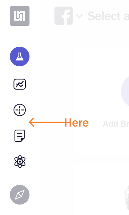
Introducing QAS (quick access sidebar) – a super-easy way to access Profiles and Groups from anywhere inside the Analyze app. New homepage with Feed and Outliers is in the background.
I love how the QAS is shaping up and believe it will translate into great user experience and fewer clicks to insights and data.
Let’s do some usability testing
Our head of customer research ran a few internal usability tests based on the scenarios I provided, and the results were all good. Finally, we found usable solutions that the whole team liked. We shipped these changes in three separate release to make it easier for the users to adapt.
Onboarding Users
To keep the learning curve lower, we split this project into three releases and carefully put some gap between them. We updated the section icons in the first release. After three weeks, the new homepage with Feed and Outliers was pushed. The sidebar navigation was rolled out after six weeks with an onboarding video.
Usually, we write an in-app blog post about the changes/new feature. However, in this case, I believed it would be much easier for users to understand the changes by watching a short video.
Our Head of Marketing did the voiceover while I wrote the script, recorded the video, and edited it too.
Outcomes
- Successful releases: Successfully released the redesigned homepage and navigation in four well planned releases.
- Smooth adaption: Account managers contacted all the customers after the redesign and reported no problems with redesign.
- 42% visits Outliers: After a month of release we found 42% of the active users regularly visiting the Outliers tab (the prominent new feature).
Lessons
- Over communicate: While in the Discovery phase, tell the whole team what we are planning to work on, what to expect, and by when.
- Stay “no” more often: Push back more on nice-to-have features, so releases can happen as planned and faster.
- Build to learn: Clearly define and share with the wider team what we intend to learn from a feature release. Include everyone on the success metrics, so they know if they did a good job overall.