Redesigning the most used UI component using the most sophisticated design tool – data.
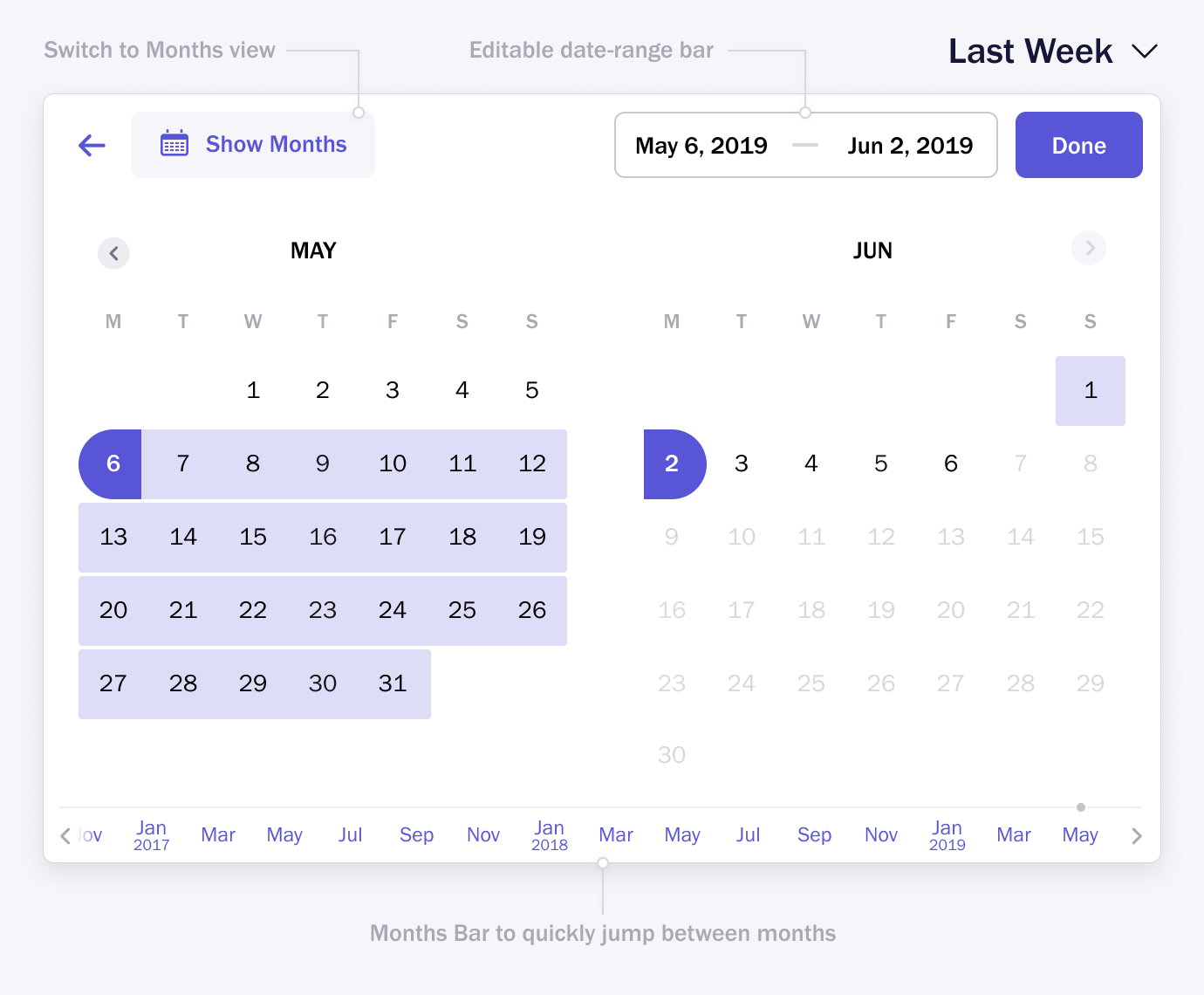
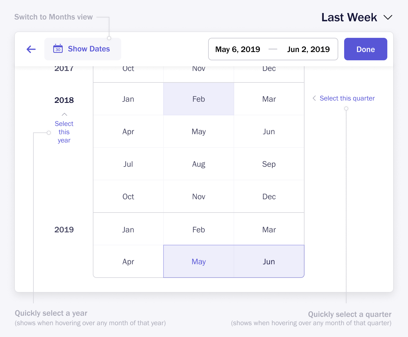
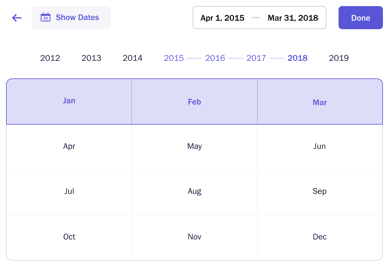
In Analyze date-picker, we intentionally didn’t allow entering the start and end dates, believing it will prevent users from making errors. But users were facing issues because of our choice, so I decided to fix it. Apart from offering the editable date inputs, we also provided better ways of selecting dates and months faster.
My Role
- Research
- Data Analysis
- Project Management
- UI/UX
- Usability Testing
Team
- Dev Lead
- Two Backend Devs
- Front-end Dev
- Myself
Tools
- Usage Data
- Google Sheets
- Moleskine
- Keynote
- Figma
Timeline
- Three months
- Jun–Aug 2019
- Two releases
Constraints
- The engineering team was always busy fixing data-related bugs and building the features requested by clients. The dev leads saw the date-picker improvement as an unimportant task with a lower priority. It took me some time and effort, and the help of our account manager to convince them before we could start the development.
- The third-party JS library our engineering team decided to use for date-picker didn’t offer everything we needed. I didn’t want to compromise the UX, so I had our front-end developer look into the JS library. She worked closely with the backend developer and successfully created the missing functionality.
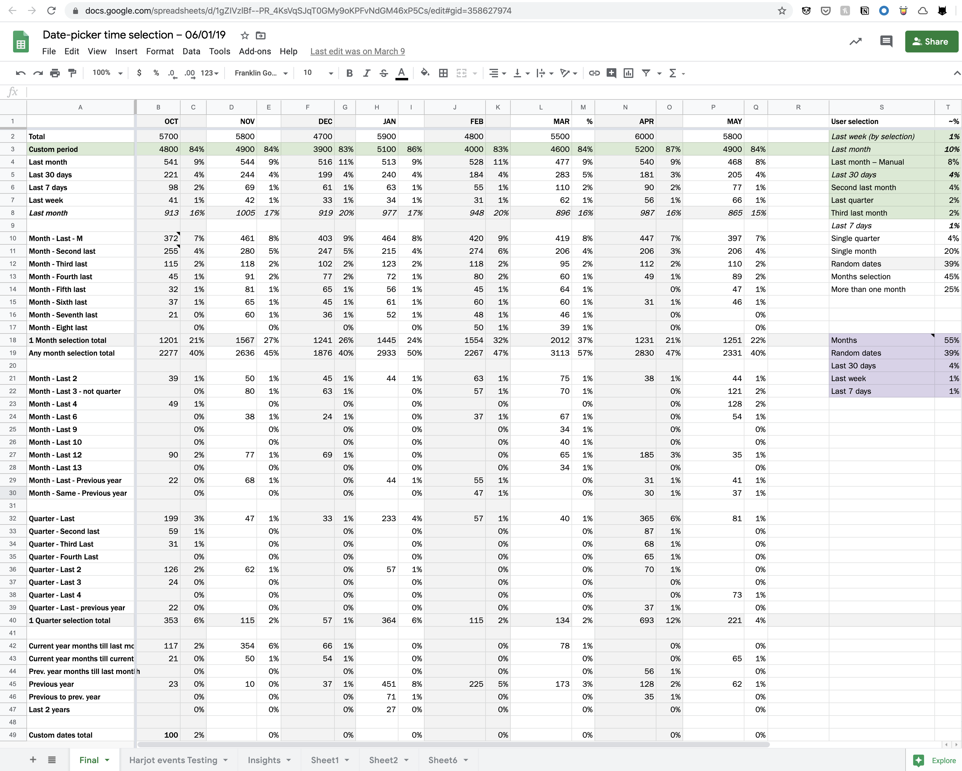
Problem
Our senior account manager pinged me for the second time, “Can we fix the date-picker? Customers are finding it hard to select longer time periods”. I promised to look into it the following week and keep her posted.
Process
What’s wrong with the existing date-picker
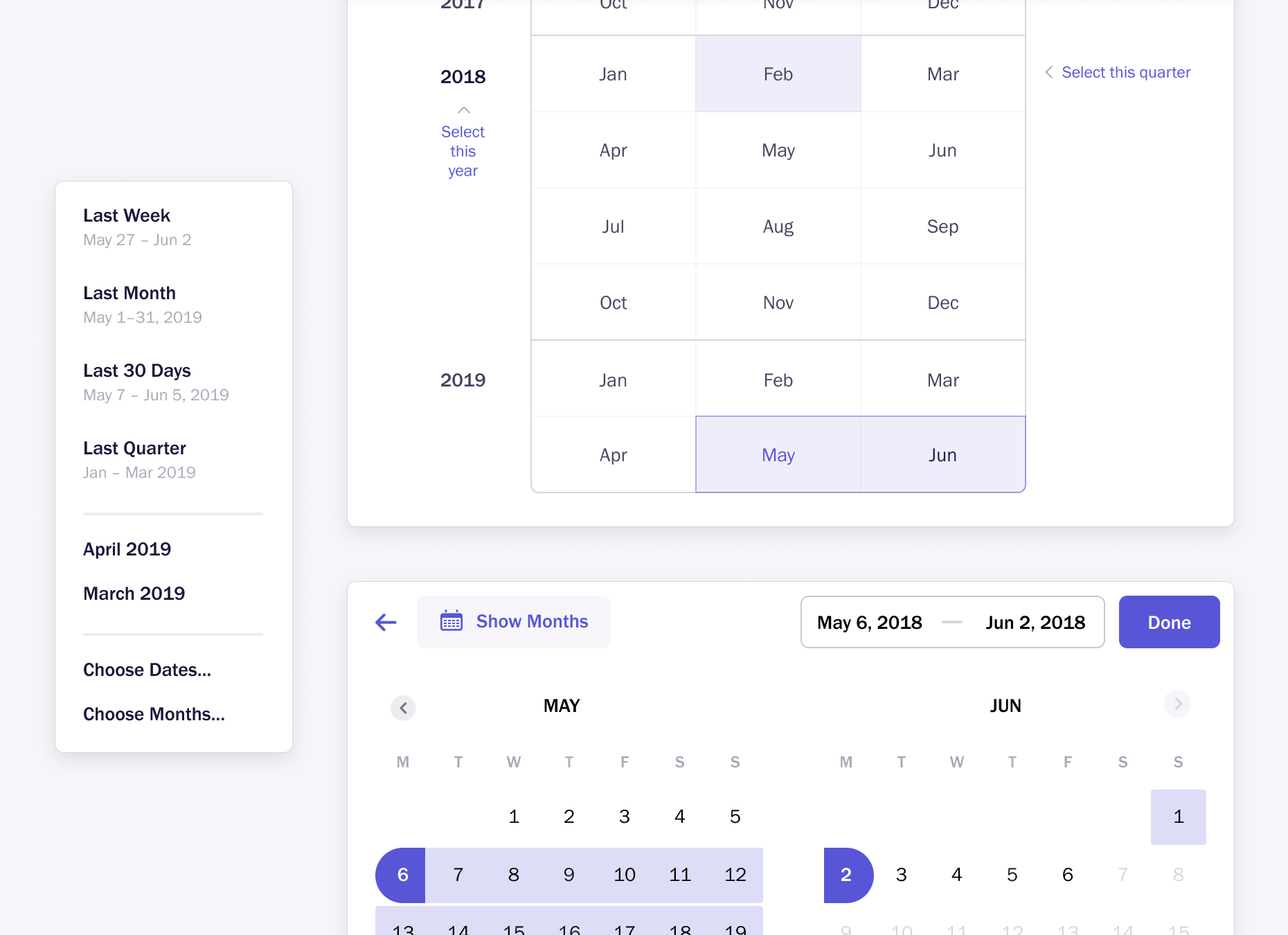
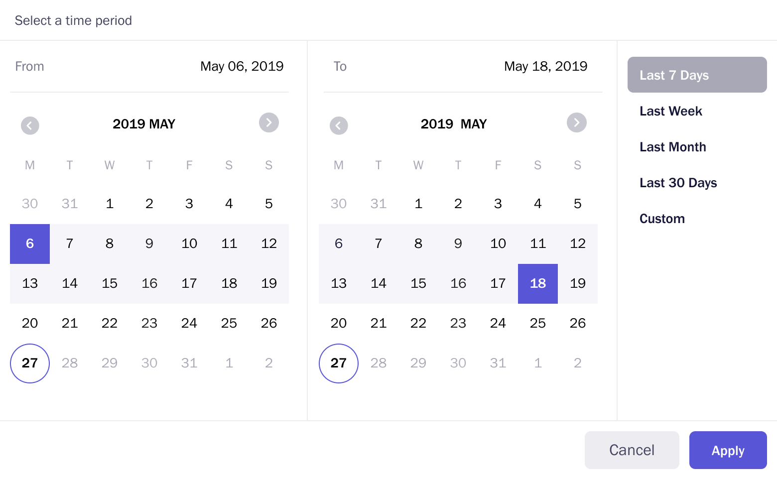
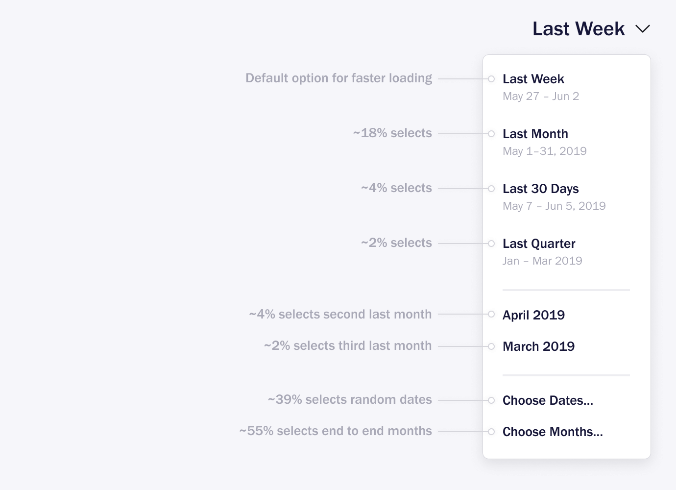
The existing date-picker doesn’t allow you to input dates. One can only click to select a date range. We have 1-click selections for the last seven days, last week, last month, and last 30 days. However, to select any particular month or other periods, such as the last two quarters and one or more years, users have to click on the calendar’s previous/next navigation buttons multiple times. It was a simple and error-free way of selecting a date range.
This was not a feature request; it didn’t come from the R&D team or our CEO or sales or marketing. This came from one of our account managers. To verify this, I reached out to a few other Account Managers and asked if they received any comments/feedback on the date-picker.
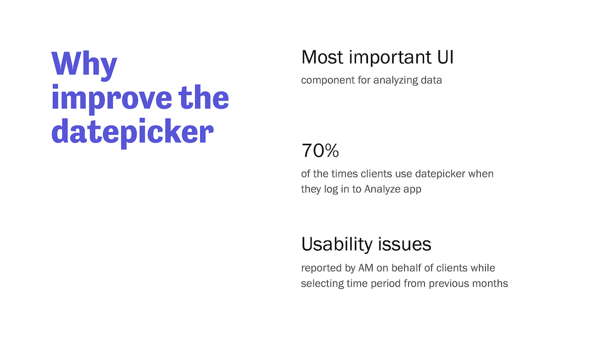
Let’s study the usage data
After they confirmed, I decided to look at the usage data. One of our front-end developers, who mostly worked with me, agreed to participate in the research. She reached out to one of our developers and collected date-picker usage data for the last eight months.
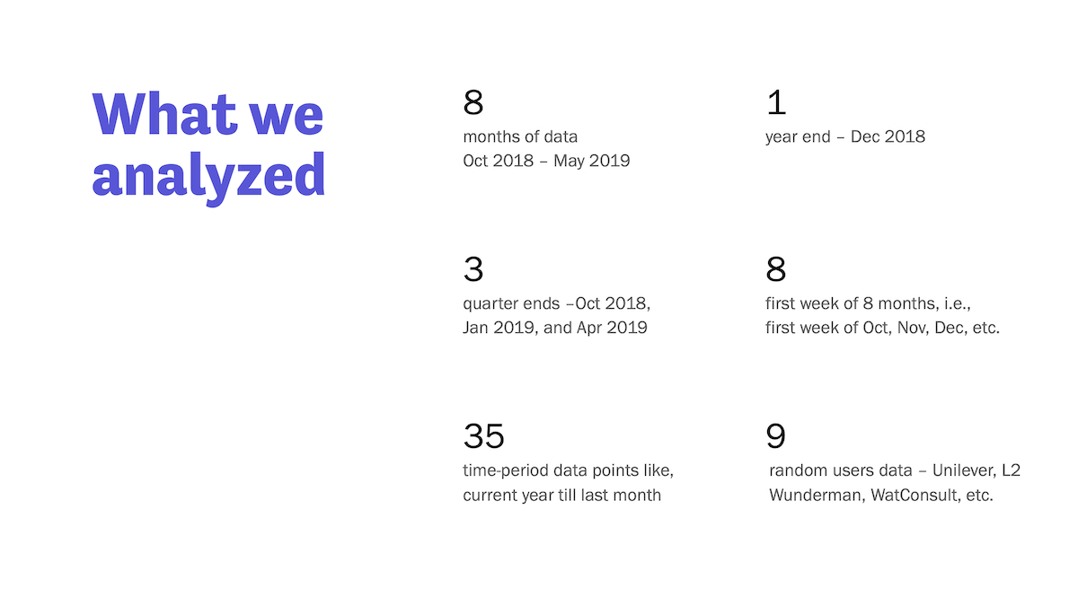
We posted our research on Slack to encourage others. This was a prime example showcasing how data can help learn more about the problem and assist in designing a better solution.


Solution
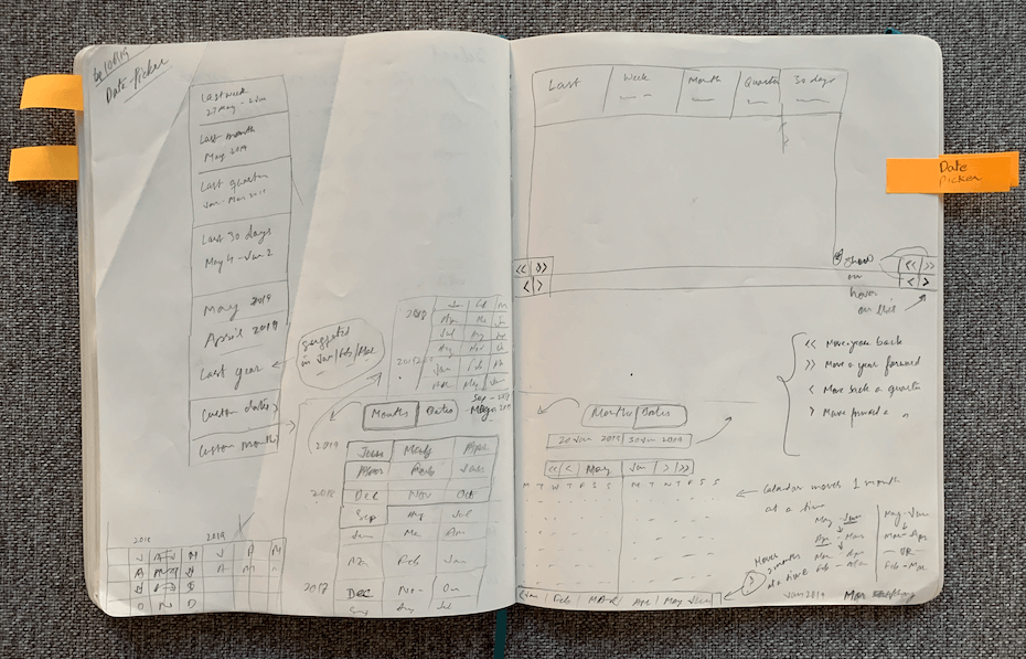
Ideation
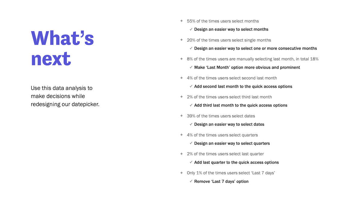
Using these insights, we decided to break the date-picker in three sections:
- A drop-down with a list of most frequently used options.
- An extended drop-down, where the first section is editable date inputs.
- Second section with the ability to quickly select months, quarters, and years.
Implementation
I shared these sketches with our dev lead for getting his input on the efforts and time it would take to build. He suggested we break it down into two releases as the second tab was a unique UI, something the JS library they were exploring didn’t support.
Final Designs
Here are the finalized designs I created in Figma.
Outcome
23%
selected “Last Month” up from 8%. This indicates we really made things easier and faster for our users.
8%
selected the “Last quater” option which we added based on usage data. Earlier this selection would take multiple clicks.
43%
selected “Custom Dates” down from 85%. This indicates people started using the default options more.
There was no change in “Last 30 days” option usage. It remained same at 4-5%.
What I Learned
- Encourage account managers to actively share user problems and feedback
- Quantitative data can be beneficial to make design decisions
- Spending focused time and effort can yield valuable insights
- People are ready to step up and take responsibilities if given an opportunity